• WORK
  • ABOUT
  • NEWS
aplin creative
  • WORK
  • ABOUT
  • NEWS

Billabong wollongong

BILLABONG, the world’s largest surf lifestyle brand is heading in a new retail direction and aplin creative is proud to be appointed the designer for this transition.

BILLABONG - design direction

BILLABONG - design direction

BILLABONG - shop front rendering

BILLABONG - shop front rendering

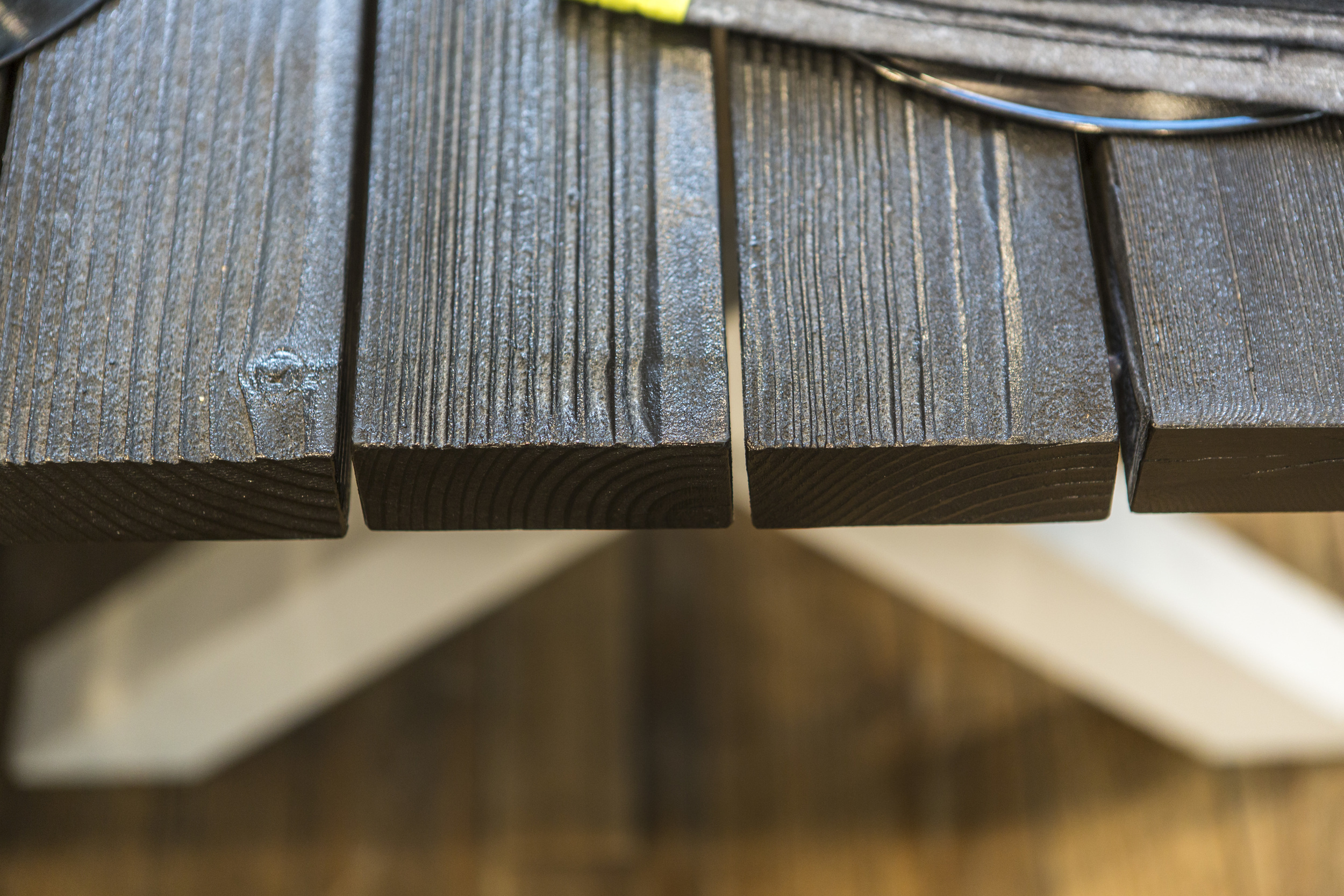
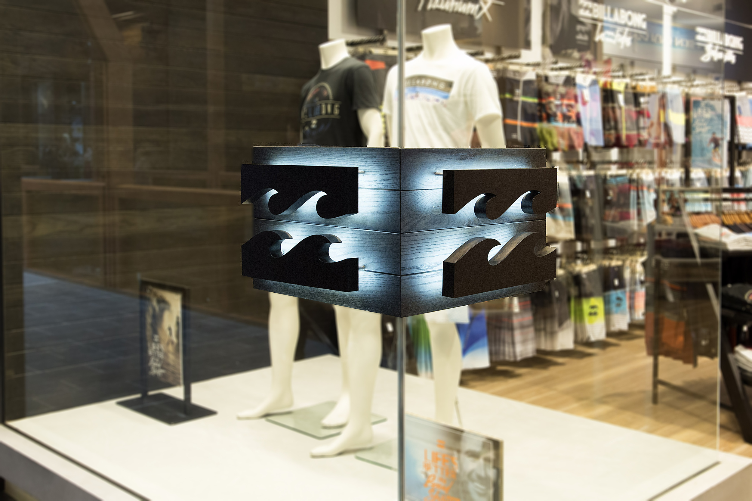
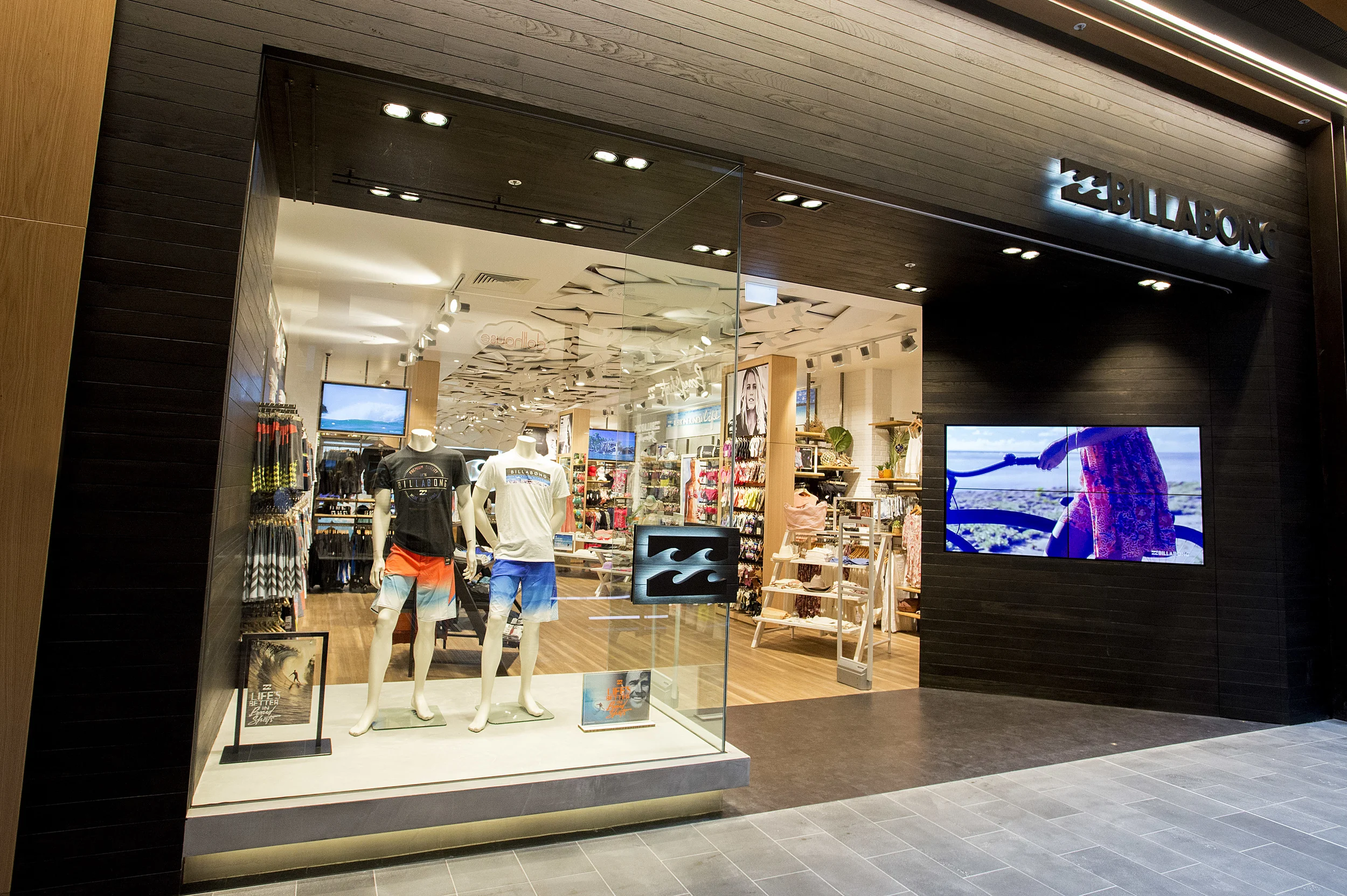
Giving the shop front simplified appeal was crucial to help the brand define itself. The shop front for the brand has long been an iconic black timber. This was retained but in a more sophisticated manor. We extended the iconic black timber back into the store to make a threshold or band of solid black. Slate flooring complements this timber portal. We used beautiful oak lining boards with black stain to achieve this bold entry.  The finish of this timber has a strong visible grain and texture but is very clean at the same time. The branding of the store was another example of adding sophistication to the shop front. We finished metal letters in a black nickel and illuminated them with strong back lighting to make them stand out. The black on black branding is a confident, clean and bold statement for Billabong. Digital media and a basic but well merchandised window display complete this striking shop front.
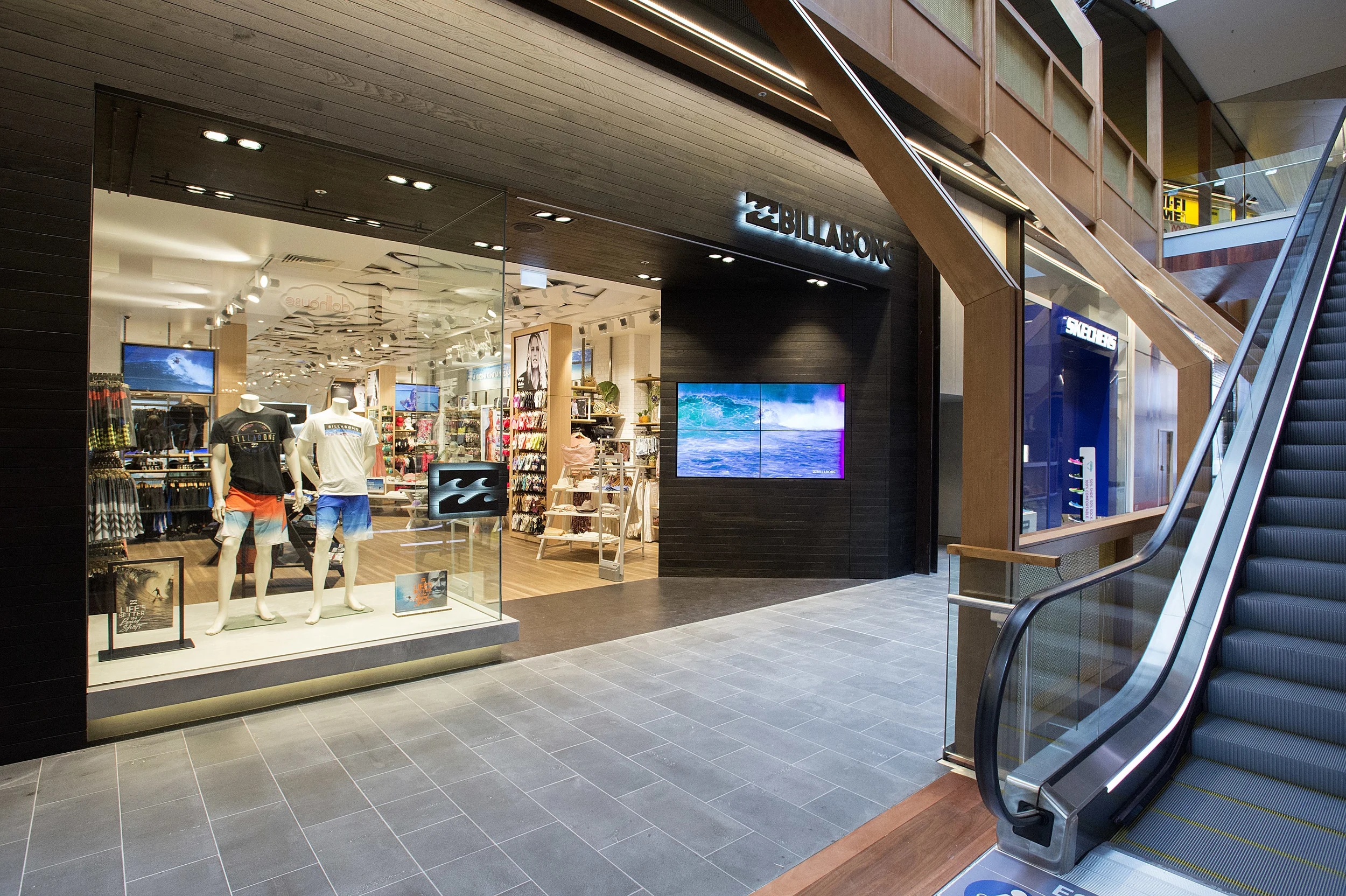
BILLABONG - shop front

BILLABONG - shop front

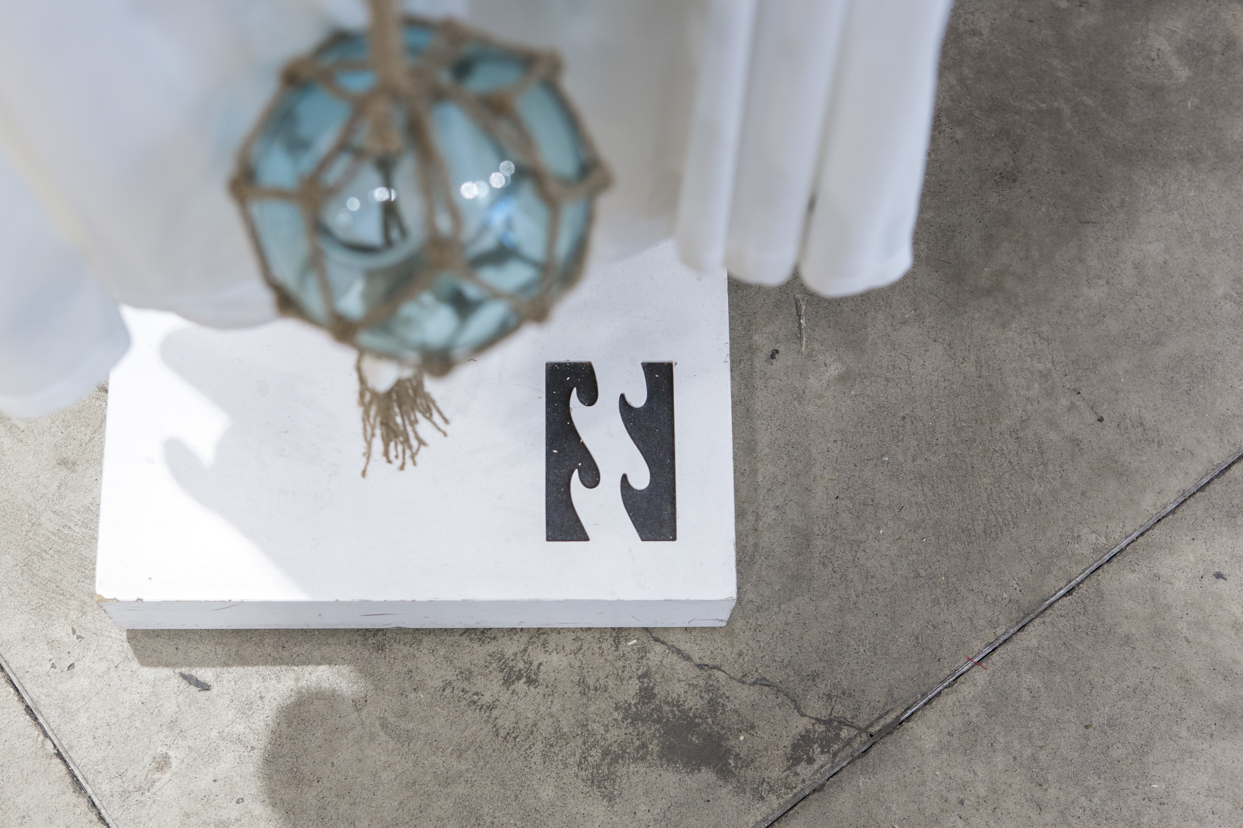
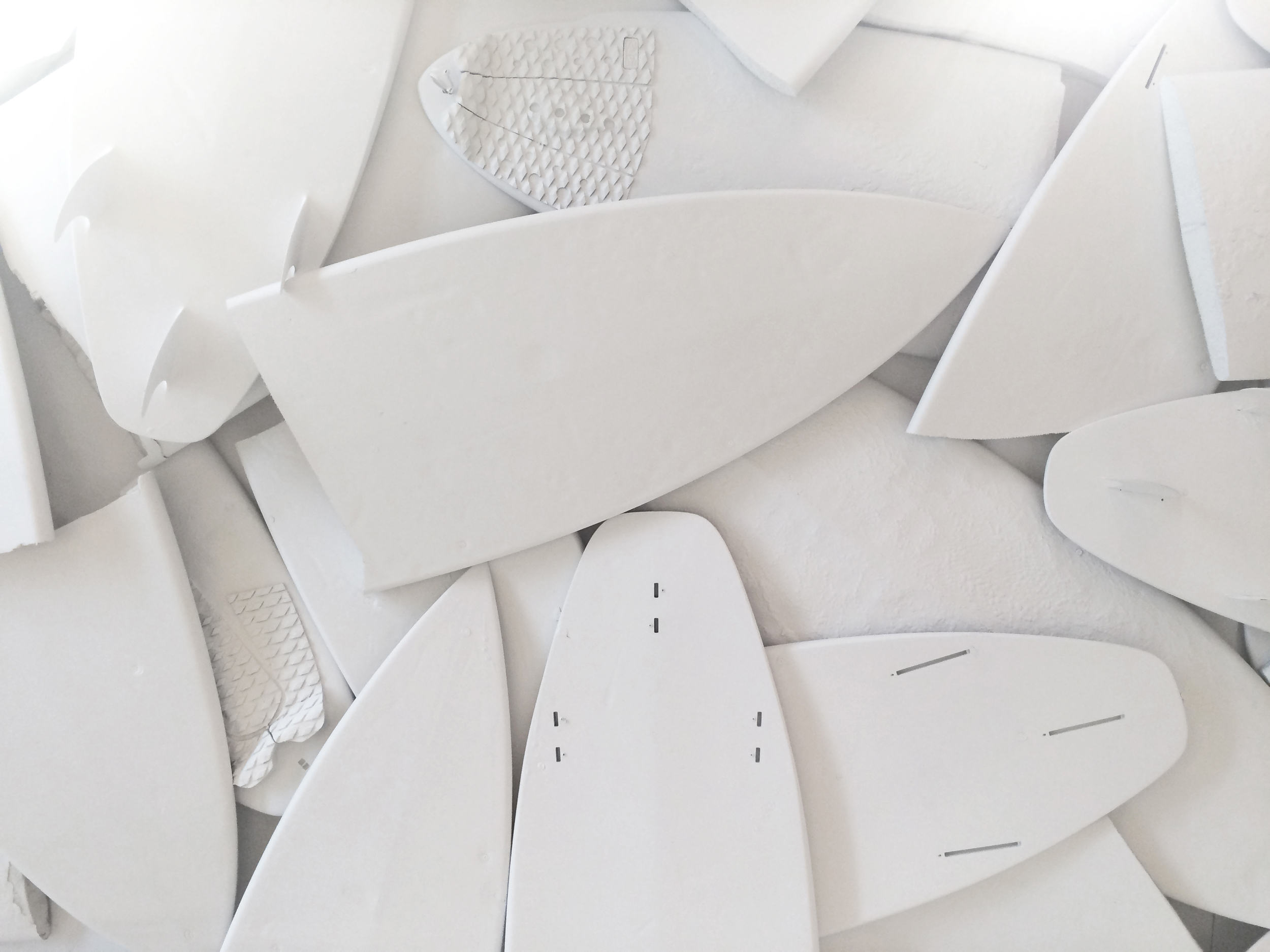
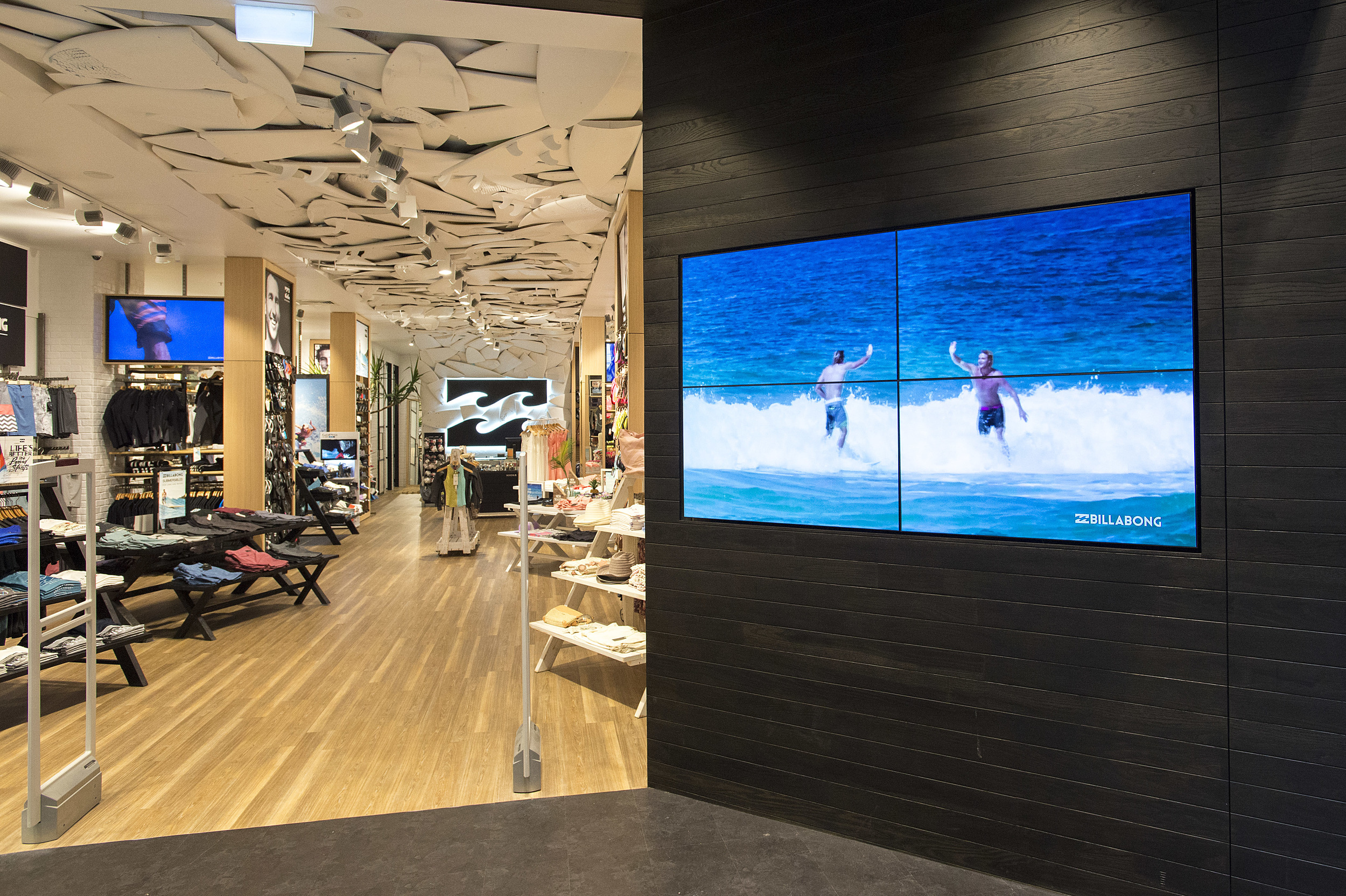
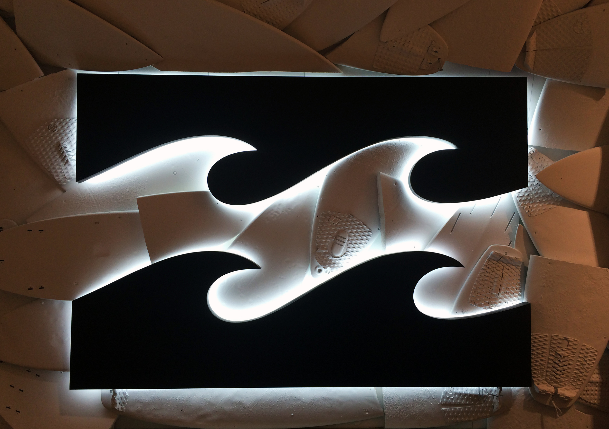
The main feature of this store is the powerful ceiling. We recessed reclaimed surfboards into a ceiling cavity which were randomly placed and finished in a matte white paint. The result is an amazing depth of texture that is relevant to the brand ideology and a real defining feature of the store. The boards wrap down the back wall behind the ‘Point Of Sale’ where they create a textured backdrop for an over sized Billabong logo. This hero sign is an iconic part of the store and a real focal point as customs wander deeper into it.
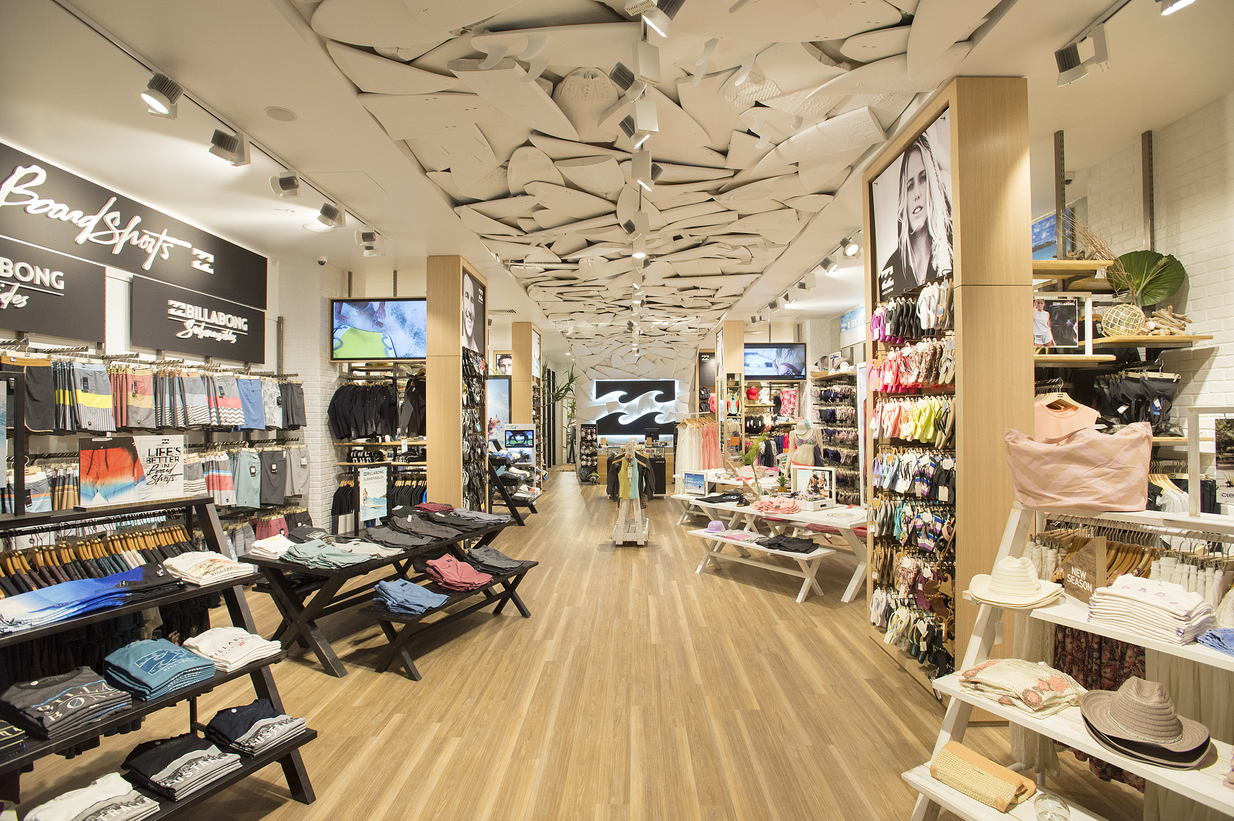
BILLABONG - feature ceiling

BILLABONG - feature ceiling

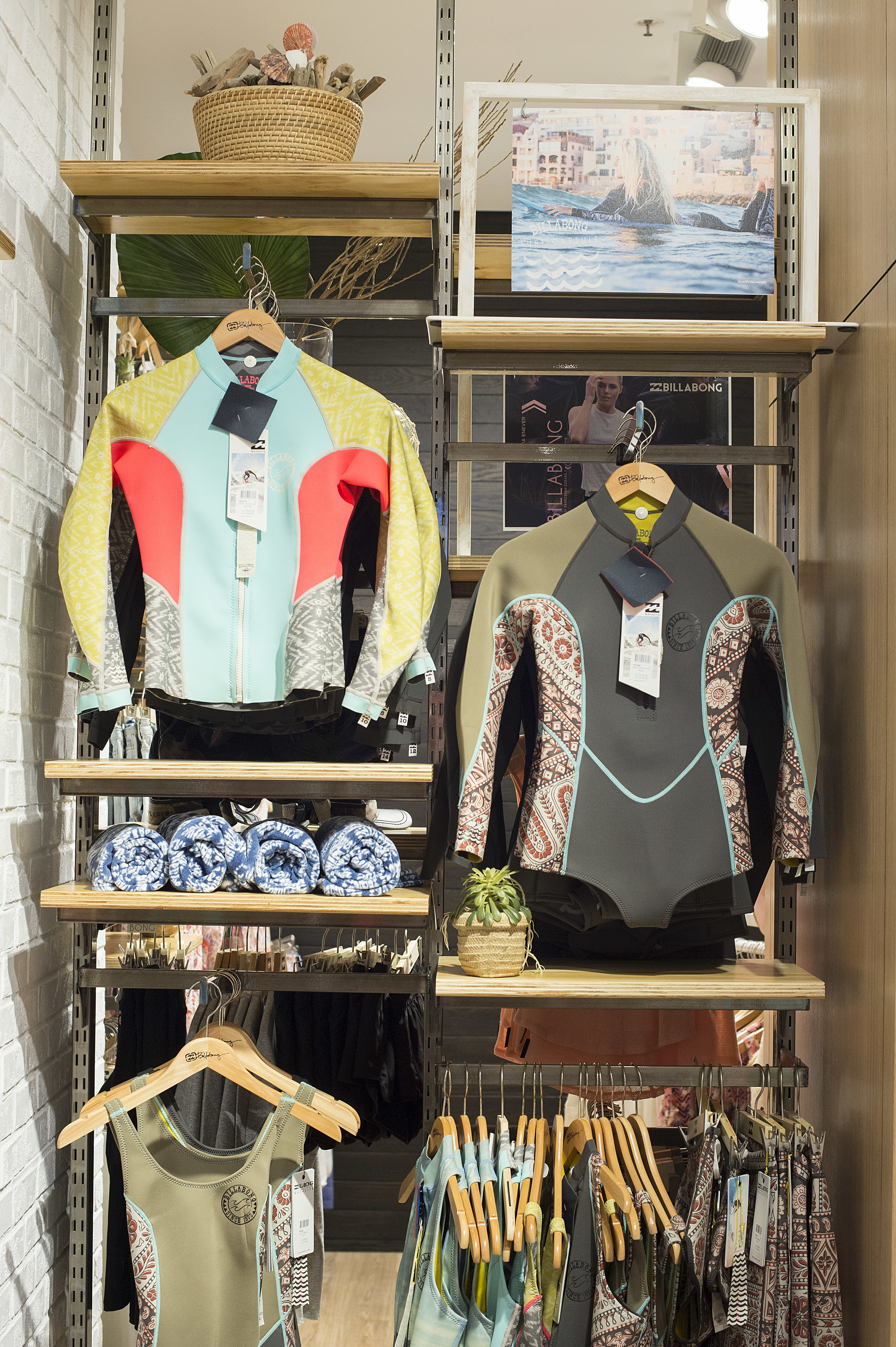
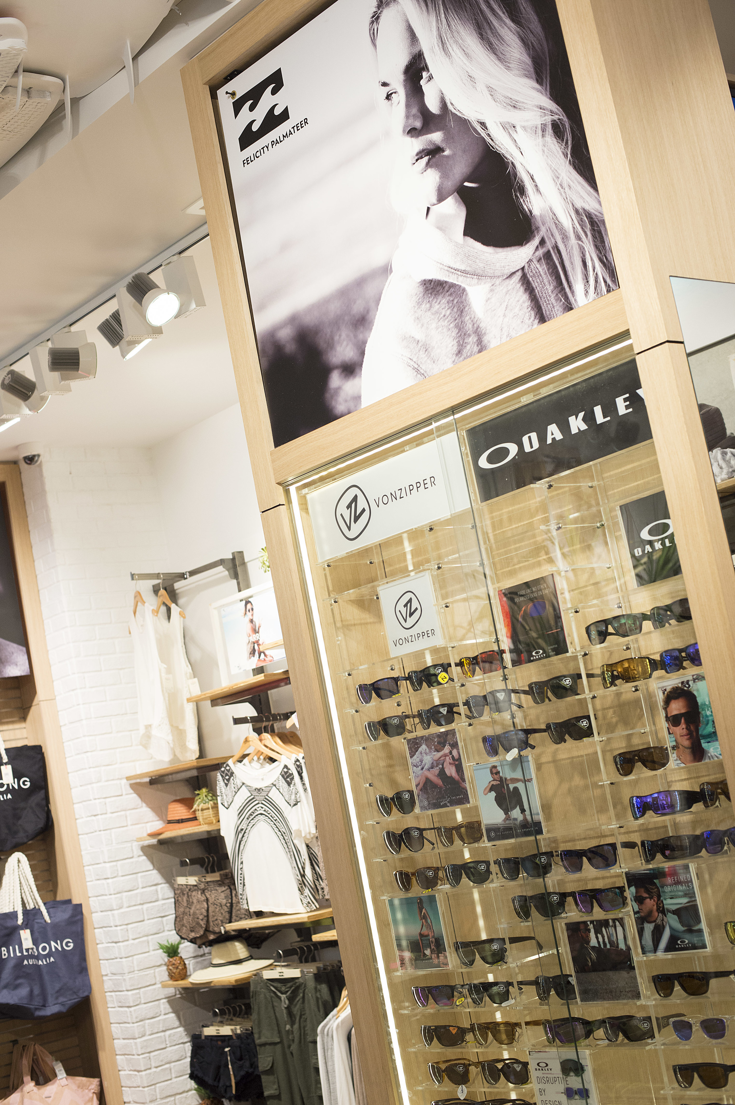
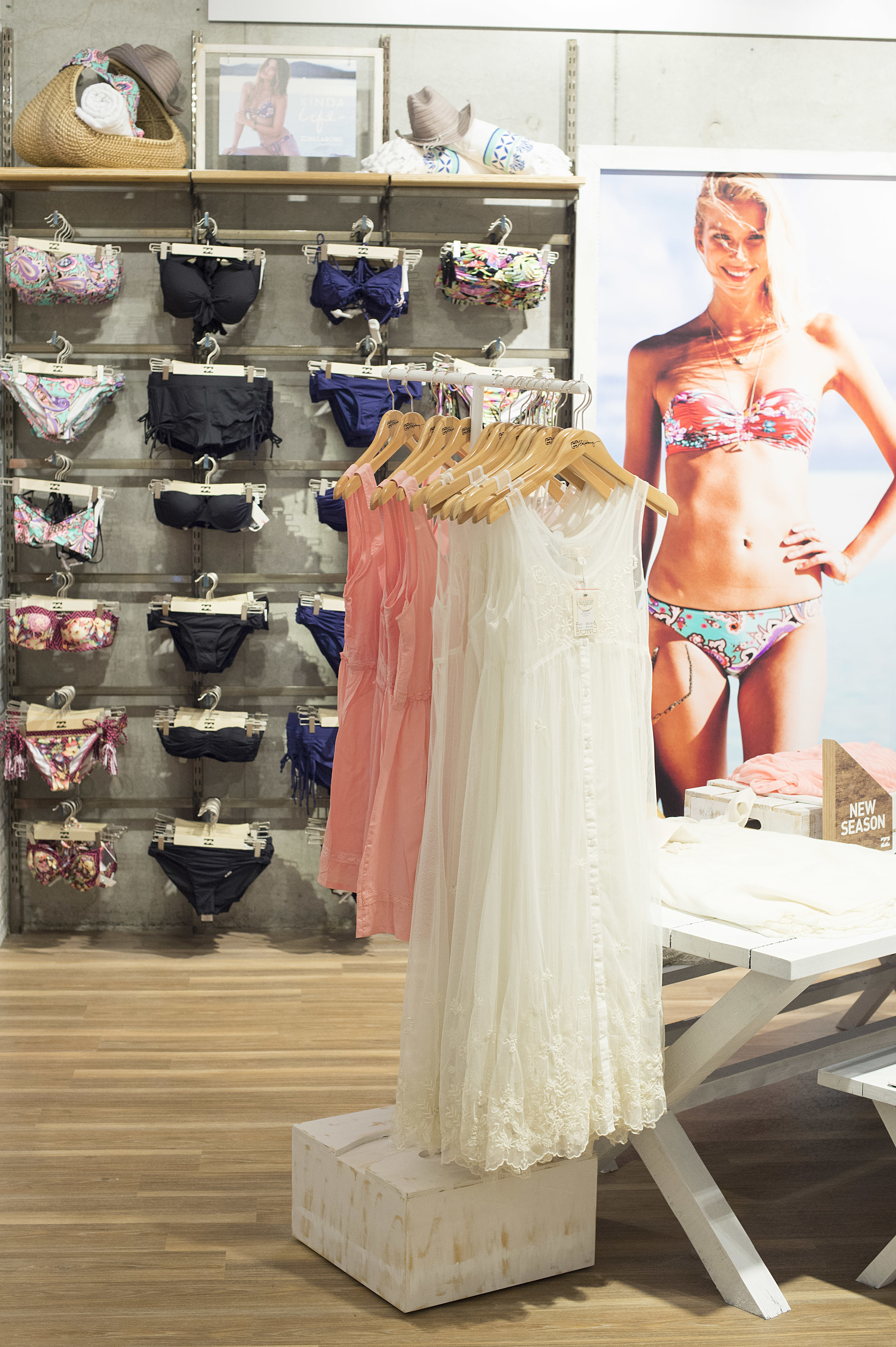
The brief asked for the stores to be simplified. Balancing the layout and reducing the finishes pallet achieved this. The majority of the walls are finished in white paint or simple textures like brick. This works as a backdrop for the bright merchandise and selected lifestyle graphics as we want to merchandise to tell the story. The interior space feels light and fresh but with some bold statements. The flooring was a rich but simple oak to complement the shop front and selected timber fixtures.

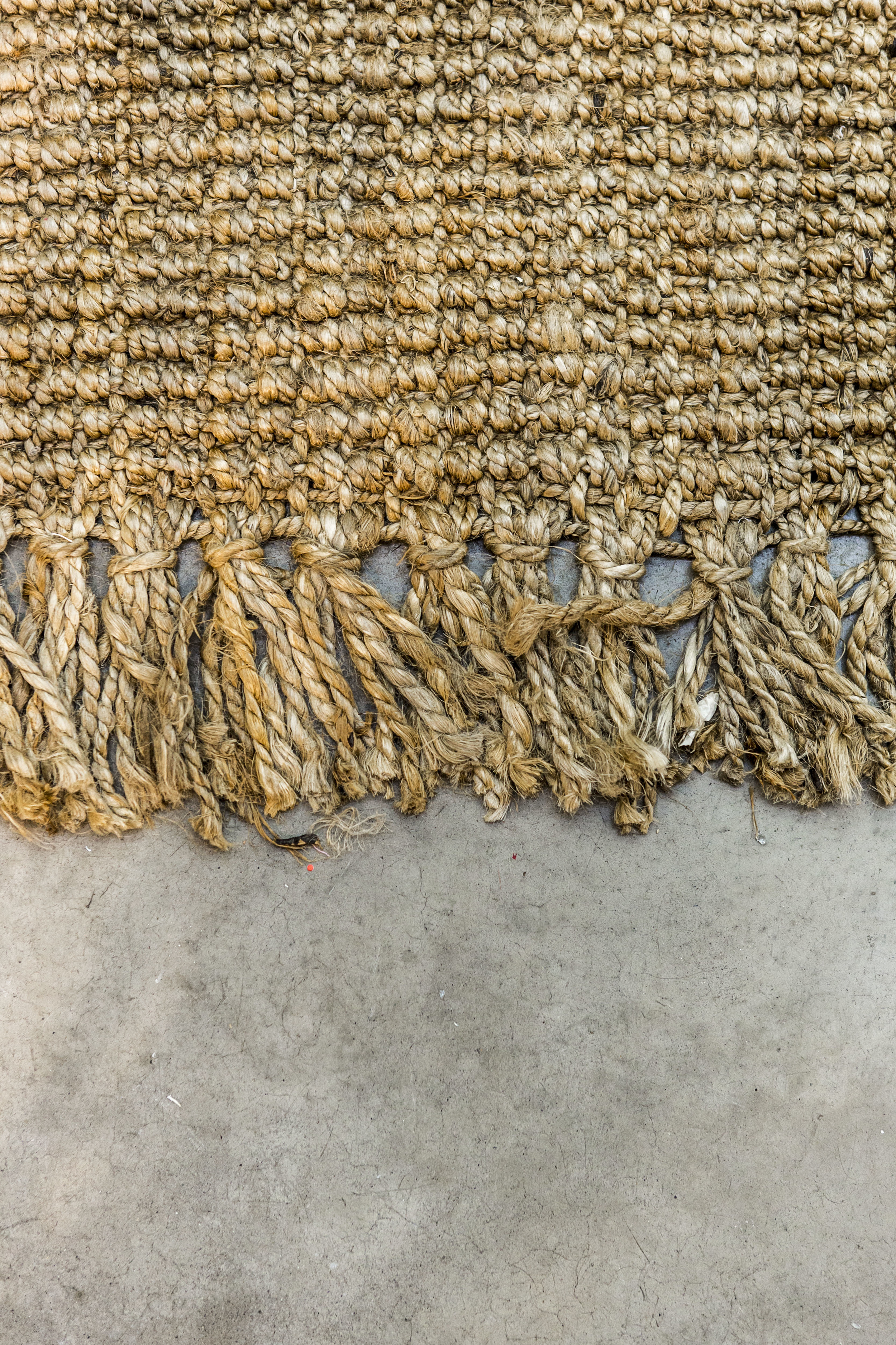
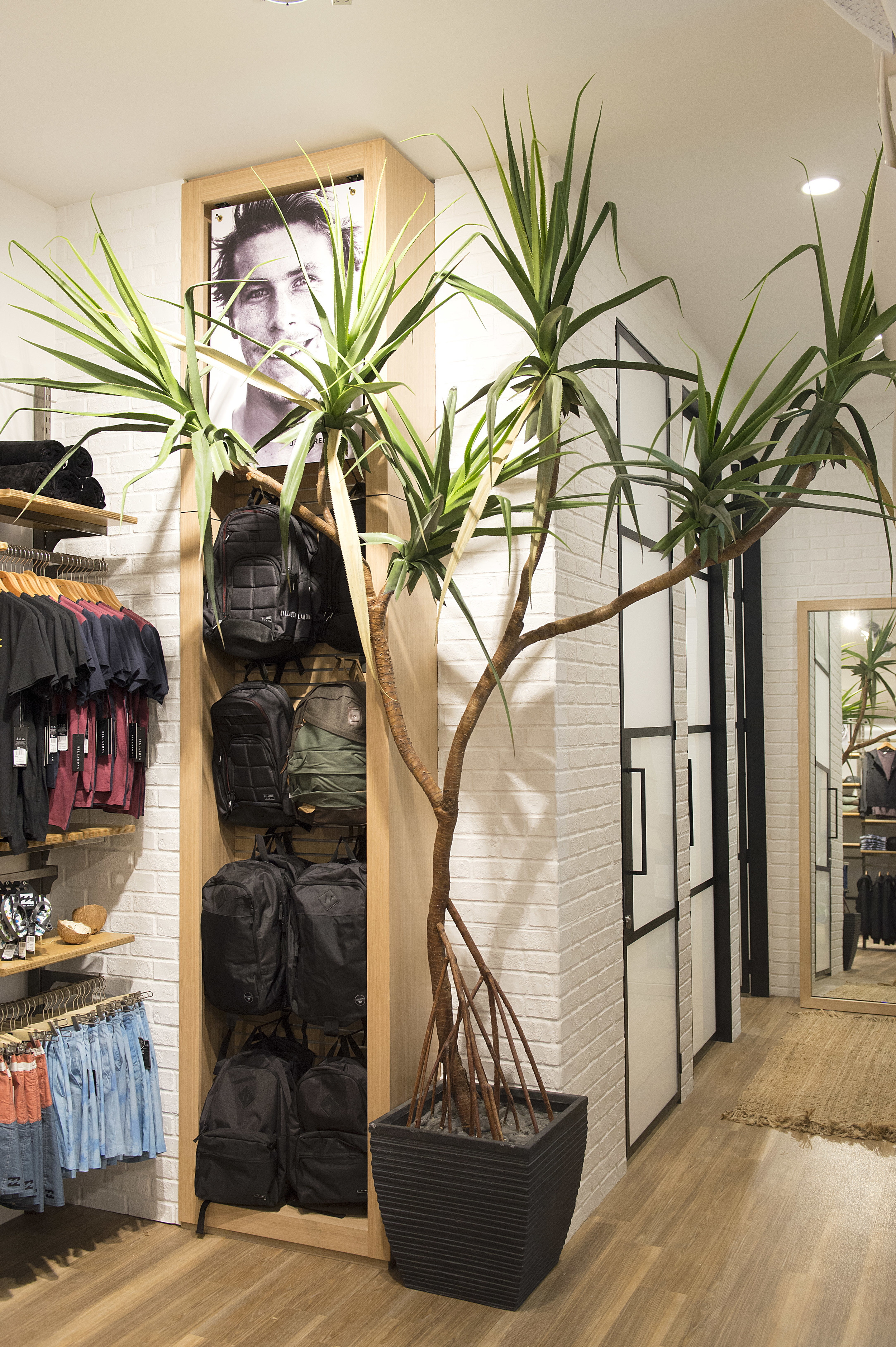
The fitting rooms are an example of adding sophistication to the store design. The simple and clean fitting room areas are textured with white brick and complemented with full height steel and glass doors. The goal was to bring an outdoors feel to these simple spaces and then we softened them with beautiful textured sisal carpets and coastal Pandanus plants.

The store fixtures follow this simple and clean brief. The focus was on textures and limited finishes for both men’s and women’s departments which create a clean backdrop for the bold apparel. Full height alcoves helped confine different products into easily shopped spaces and kept everything clean and identifiable.
IMG_6936.JPG
DSC_1928.jpg
_W8A3550.jpg
_W8A3608.jpg
_W8A3575.jpg
_W8A3583.jpg
_W8A3593.jpg
IMG_6953.JPG
DSC_1935.jpg
DSC_1938.jpg
DSC_1957.jpg
DSC_1942.jpg
DSC_1948.jpg
DSC_1950.jpg
IMG_6936.JPG DSC_1928.jpg _W8A3550.jpg _W8A3608.jpg _W8A3575.jpg _W8A3583.jpg _W8A3593.jpg IMG_6953.JPG DSC_1935.jpg DSC_1938.jpg DSC_1957.jpg DSC_1942.jpg DSC_1948.jpg DSC_1950.jpg

It was a privilege to be involved in the design of this store for a world-renowned brand. We have made our mark with the new look for Billabong, turning it into a more sophisticated shopping experience but still keeping the iconic ideology of the brand throughout.

Wednesday 12.31.14
Posted by Chris Aplin
Comments: 1
 

aplin creative becomes a member of the Design Institute of Australia

aplin creative is proud to become a member of the Design Institute of Australia

The Design Institute of Australia (DIA) is Australia's professional membership body for designers and design businesses.

Membership in the DIA indicates your status as a qualified, experienced, ethical practicing professional.

Since its formation in 1947 the DIA has been actively improving the community recognition and status of professional designers.

It's a professional body for designers, founded by the design professions, and run and funded by designers.

To find out more about the Design Institute of Australia go to www.dia.org.au

Thursday 12.25.14
Posted by Chris Aplin
 

ENSOPET by bokashi.com.au

Bokashi Composting Australia, engaged aplin creative to help design and develop their innovative new product EnsoPet.

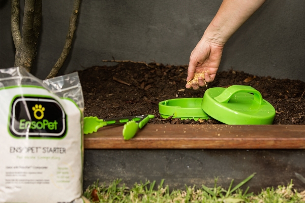
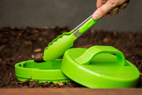
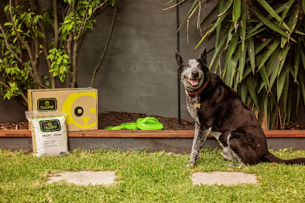
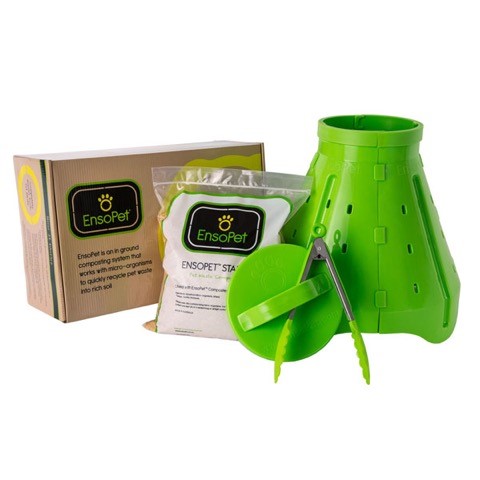
“EnsoPet is an innovative inground composting system, specifically designed for composting pet waste, easily and hygienically. EnsoPet composts all pet waste such as Dog, Cat, Rabbit and Guinea Pig. EnsoPet keeps your yard free of pet waste and prevents it ending up in land fill, while returning carbon to the soil and rebuilding the soil on a microbial level.”

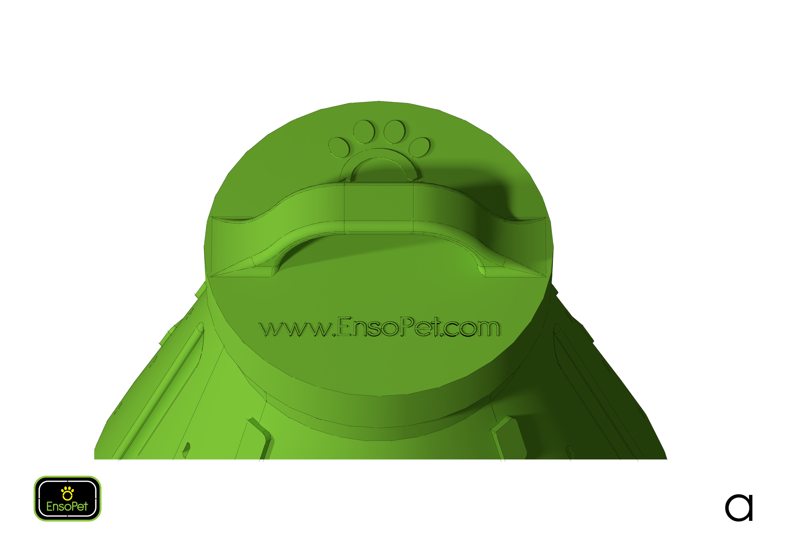
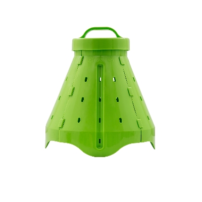
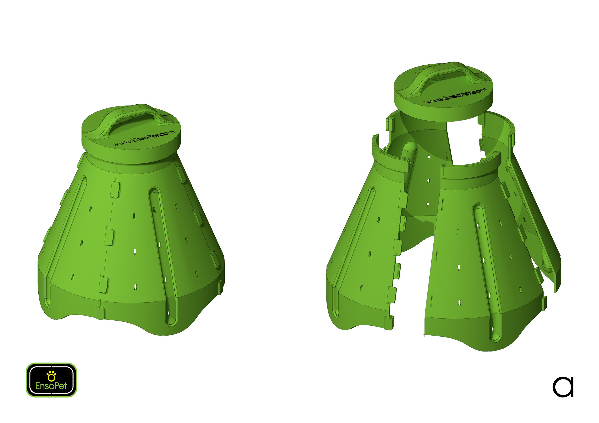
The brief for the EnsoPet unit was to develop the functional cone body and the lid. The cone body of the unit was to be a specific size for the function of the unit but also needed to be easily transportable. We achieved this by making the cone in four equal parts. This meant the cone could be flat packed for shipping and also saving on manufacturing cost.

ENSOPET - concept

ENSOPET - concept

ENSOPET - concept

ENSOPET - concept

“Maree O’Malley founded Bokashi Composting Australia in 2004 after experiencing bokashi composting in New Zealand. Impressed by the principles, convenience and philosophy of the system, Maree was keen to try it for herself back home in Australia. However, Maree was disappointed in her search to find the bokashi system so decided to set up her own business and bring this wonderful way of composting across the Tasman Sea to Australia.”

Normal
0


false
false
false

EN-AU
JA
X-NONE


 <w:LatentStyles DefLockedState="false" DefUnhideWhenUsed="true"
DefSemiHidden="true" DefQFormat="false" DefPriority="99"
LatentStyleCount="276">…

ENSOPET - Maree O’Malley 

EnsoPet needed to be easy to assemble and use, so we designed the unit to clip together easily which also helps to locate each part in place. The clips were designed with enough hold so that when the unit is buried in the ground it can take the weight of the soil around it. The unit has functional perforations to allow access for moisture and worms and strengthening ribs to prevent and twisting or collapse. The lid of the unit has an easy use handle and branding. All of the components are injection molded plastic with a recycled content.

For more information: www.bokashi.com.au/EnsoPet.html

© Copyright 2014 Bokashi Composting Australia. All rights reserved.

BUDGET: $

DESIGN TIME: 2 MONTHS

MANUFACTURE: 2 MONTHS

adding starter w bag st__0987-251.jpg
adding waste__0984-120.jpg
Dog installed box starter__0961-851.jpg
Bokashi_0005_web-629.jpg
EnsoPet everything in box and box.jpg
adding starter w bag st__0987-251.jpg adding waste__0984-120.jpg Dog installed box starter__0961-851.jpg Bokashi_0005_web-629.jpg EnsoPet everything in box and box.jpg
Monday 12.15.14
Posted by Chris Aplin
Comments: 1
 

aplin creative becomes a member of the Retail Design Institute

aplin creative is proud to become a profesional member of the Retail Design Institute of Australia

The Retail Design Institute is a professional association of retail design specialists with over 1000 members in 15 chapters worldwide including our Sydney/Melbourne chapter.

To find out more about the Retail Design Institute go to www.rdi.org.au

Thursday 12.11.14
Posted by Chris Aplin
 

aplin creative becomes a member of The Designers Institute

aplin creative is proud to become an international member of The Designers Institute of New Zealand

The Designers Institute of New Zealand was formed in 1991 by the merger of the New Zealand Society of Industrial Designers (formed 1960), and the New Zealand Association of Interior Designers (formed 1968). Today the Designers Institute represents graphic design, interactive design, spatial design, product design, design management, service design and design education.

To find out more about The Designers Institute of New Zealand go to www.dinz.org.nz

Thursday 12.11.14
Posted by Chris Aplin
Comments: 1
 

aplin creative feature on Don't Kill My Vibe

aplin creative was pleased when approached to feature on ‘don't kill my vibe’ this week. The online design magazine and blog are based in Germany. They approached us wanting to know more about what we do and to tell them a bit about the products we have designed. It is great to get positive feedback from industry experts and fellow designers.

Have a look at the article and the other great work featured on their site http://www.dontkillmyvibe.net/aplin-design-studio-sydney/

http://www.dontkillmyvibe.net/aplin-design-studio-sydney/

http://www.dontkillmyvibe.net/aplin-design-studio-sydney/

Wednesday 04.23.14
Posted by Chris Aplin
 

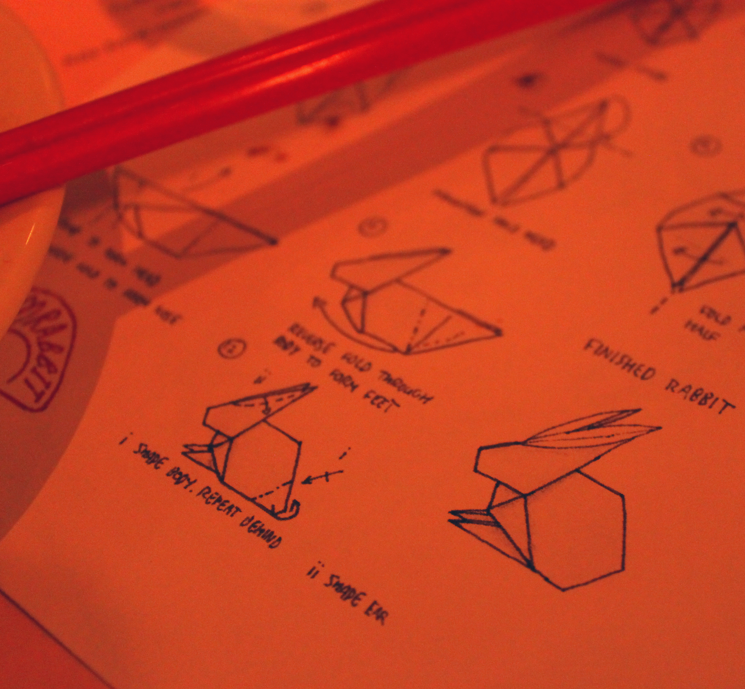
RED RABBIT

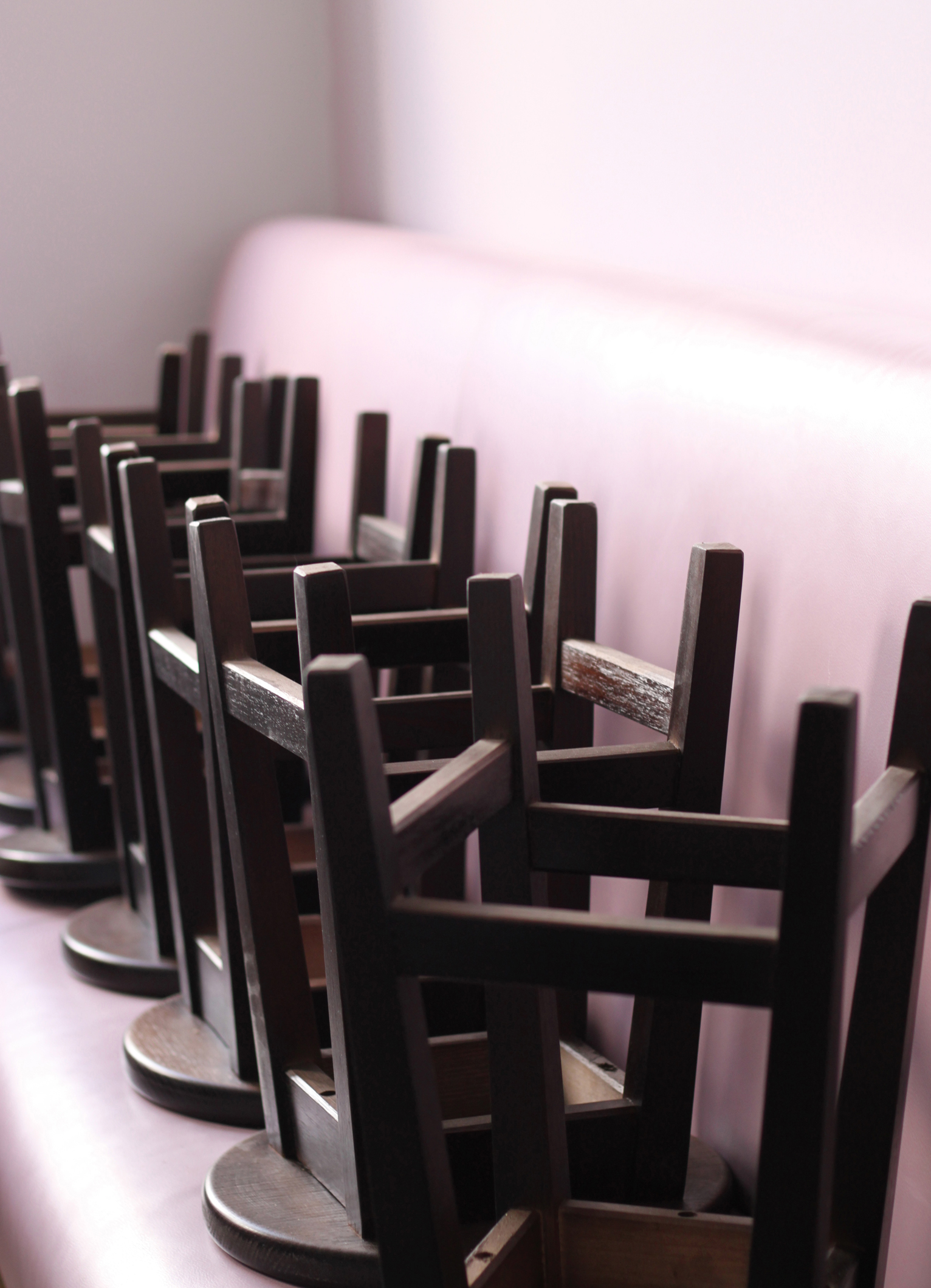
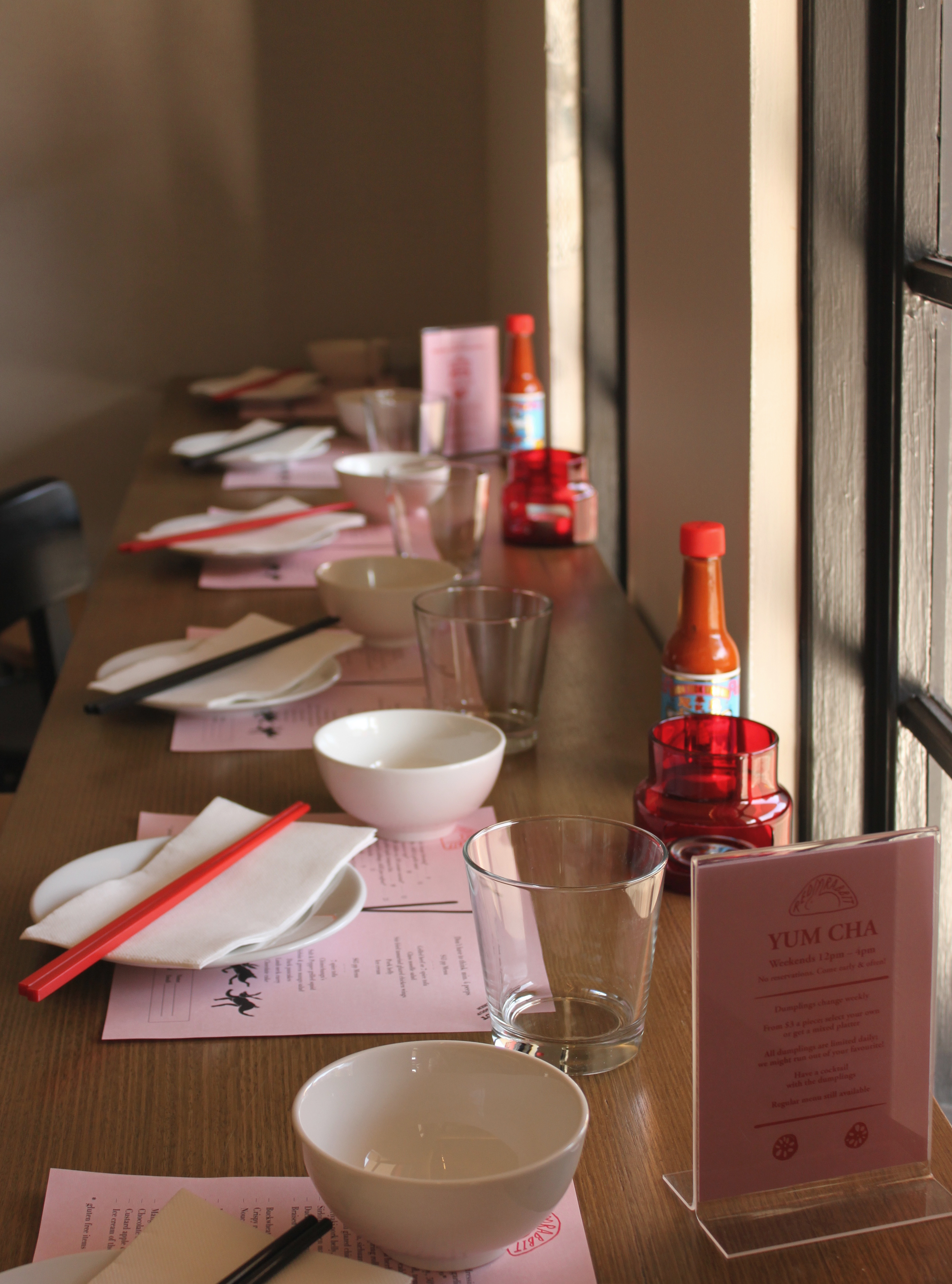
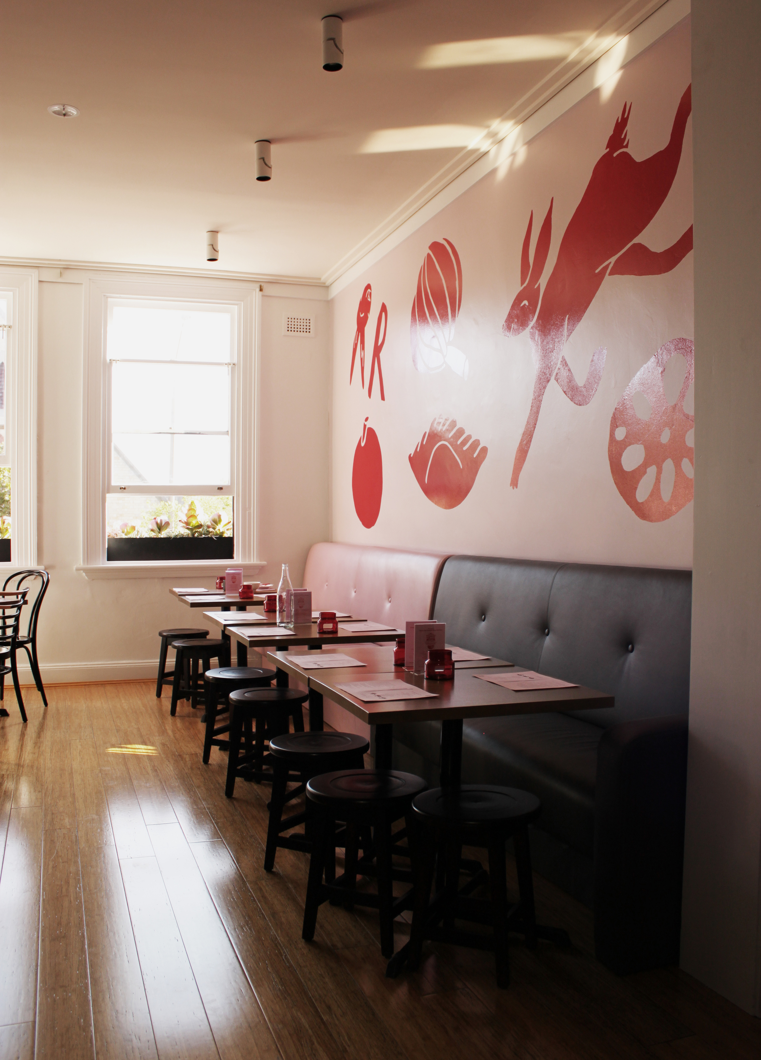
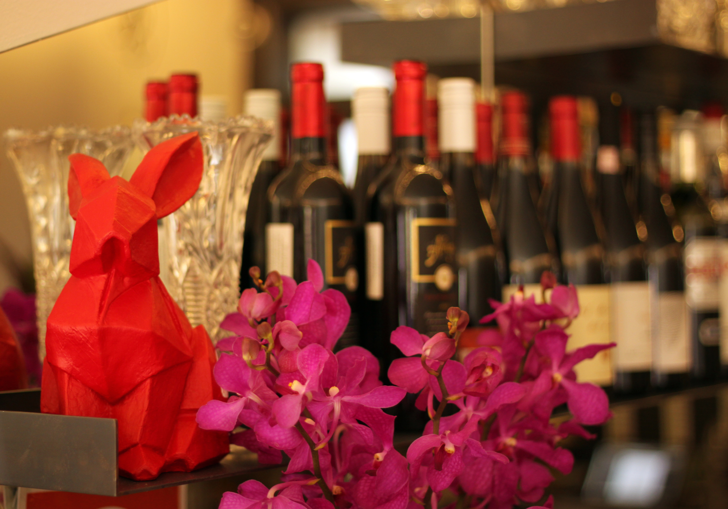
Sydney’s dining institution, Claude's, was closed in early September, the latest victim of Sydney’s push towards mid-market restaurants. Claude's reopened in late September as the pan-asian Red Rabbit. The Red Rabbit has turned the fine dining institution into a fun, vibrant, colourful take on modern Asian. 

aplin creative was proudly appointed to lead the transition.

RED RABBIT - facade

RED RABBIT - facade

RED RABBIT&nbsp;

RED RABBIT 

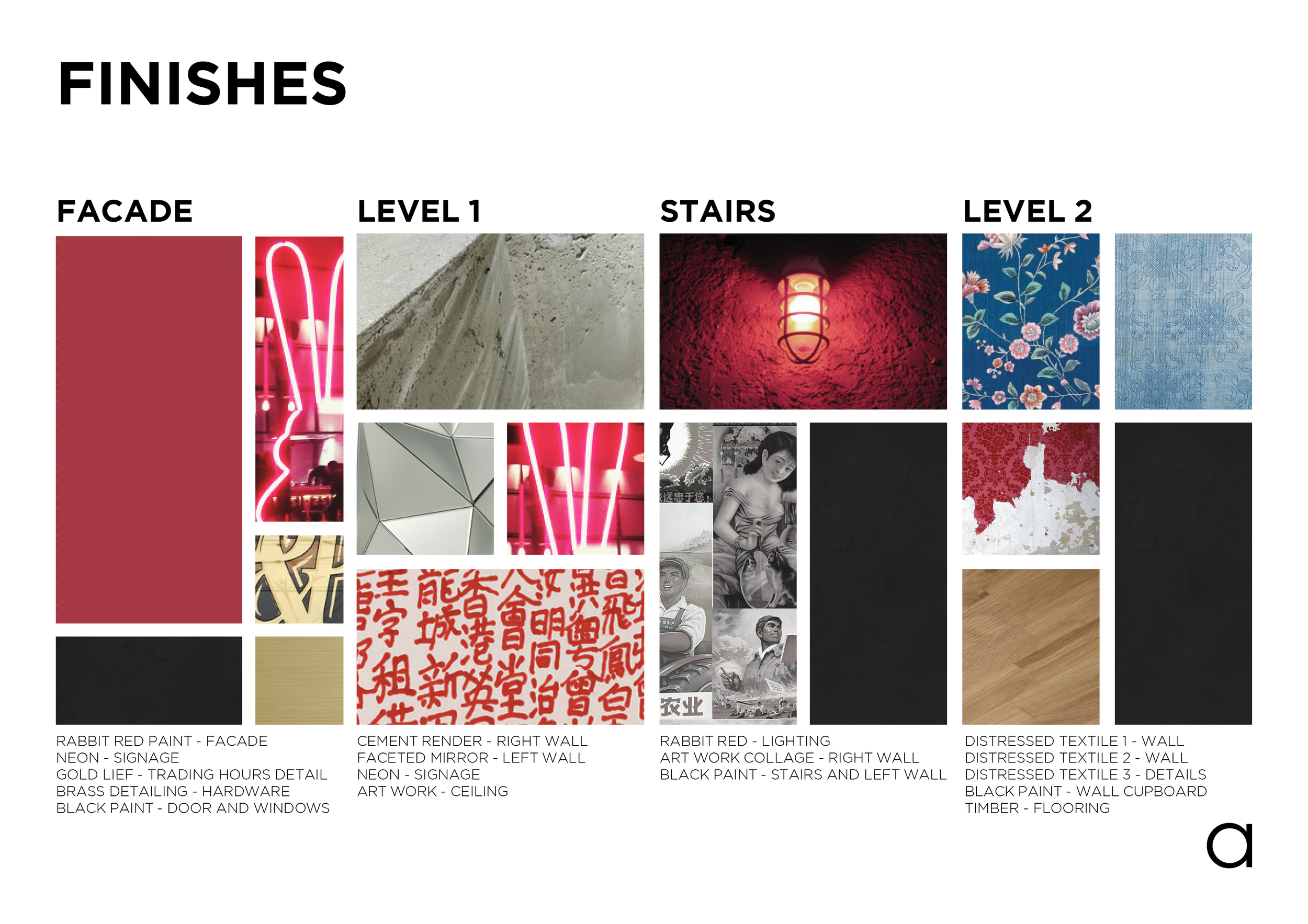
The design brief was to simply turn the existing restaurant on its head, and add the Flavour, Colour, Creativity and Culture that it was lacking. The inspiration was found in the flavors and colours of Asian cuisine. Modern Asian art and culture were also used to inspire an exciting environment. 

RED RABBIT -&nbsp;design exploration and direction

RED RABBIT - design exploration and direction

RED RABBIT - finishes

RED RABBIT - finishes

The colour pallet was bold, but clean and controlled. The selection of colours, detailing and finishes were directly from Asian influences. The textures were references to the urban environment of modern Asian cities. Graphics and branding were used to introduce the creative culture that the restaurant atmosphere and cuisine reflects. The furniture and fixtures were all selected with consideration to the interior and the different uses of the bar and dining levels.

RED RABBIT - elevation

RED RABBIT - elevation

The FACADE was painted in a bold red paint with detailing in black and polished bronze. Strong branding helps the facade stand out in its prominent location on Oxford Street. 

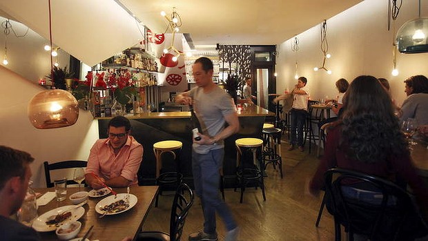
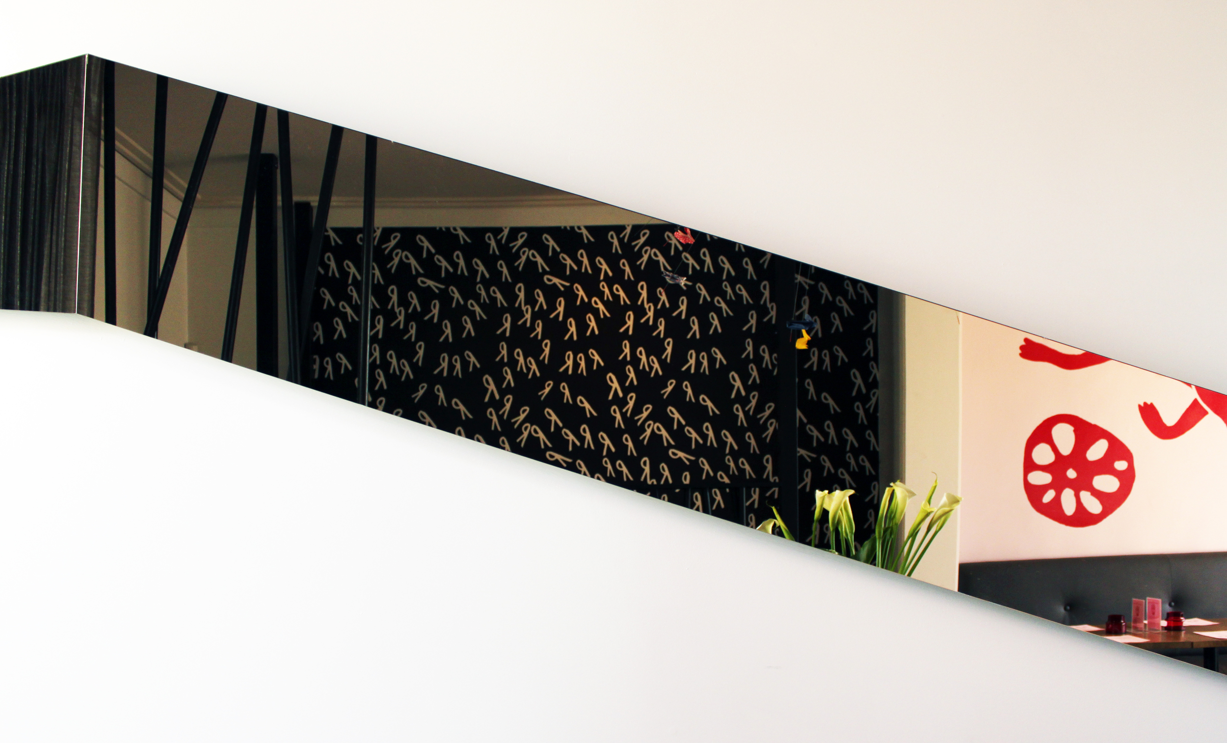
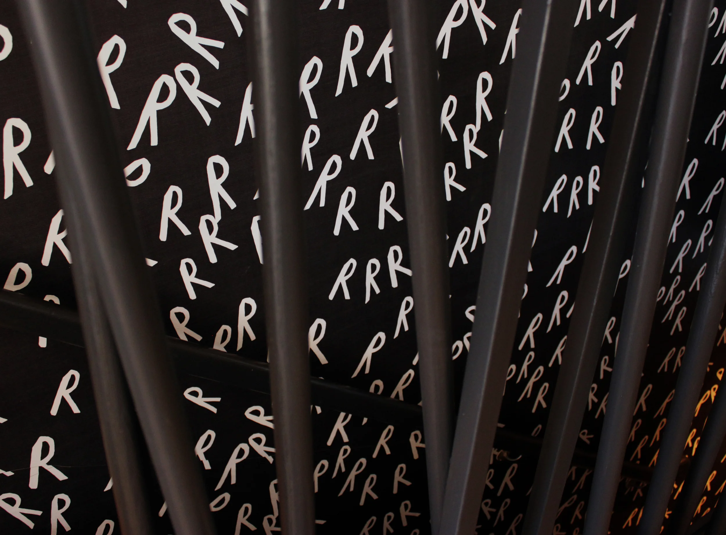
The LEVEL 1 interior is the bar and casual dining. This space is vibrant and fun. The bar is the main feature where clients interact, dine and enjoy a glass of wine. The complex space was cleaned up and simplified. We added a subtle texture to the main wall and additional lighting to play with shadowing. Behind the bar we used graphics, custom wall coverings and retained the existing mirrors to create a strong and fun feature. The custom wall covering which you follow up the stairs, makes you feel as if you are exploring a darker, different area of the restaurant, then when you emerge, you have arrived on LEVEL 2. 

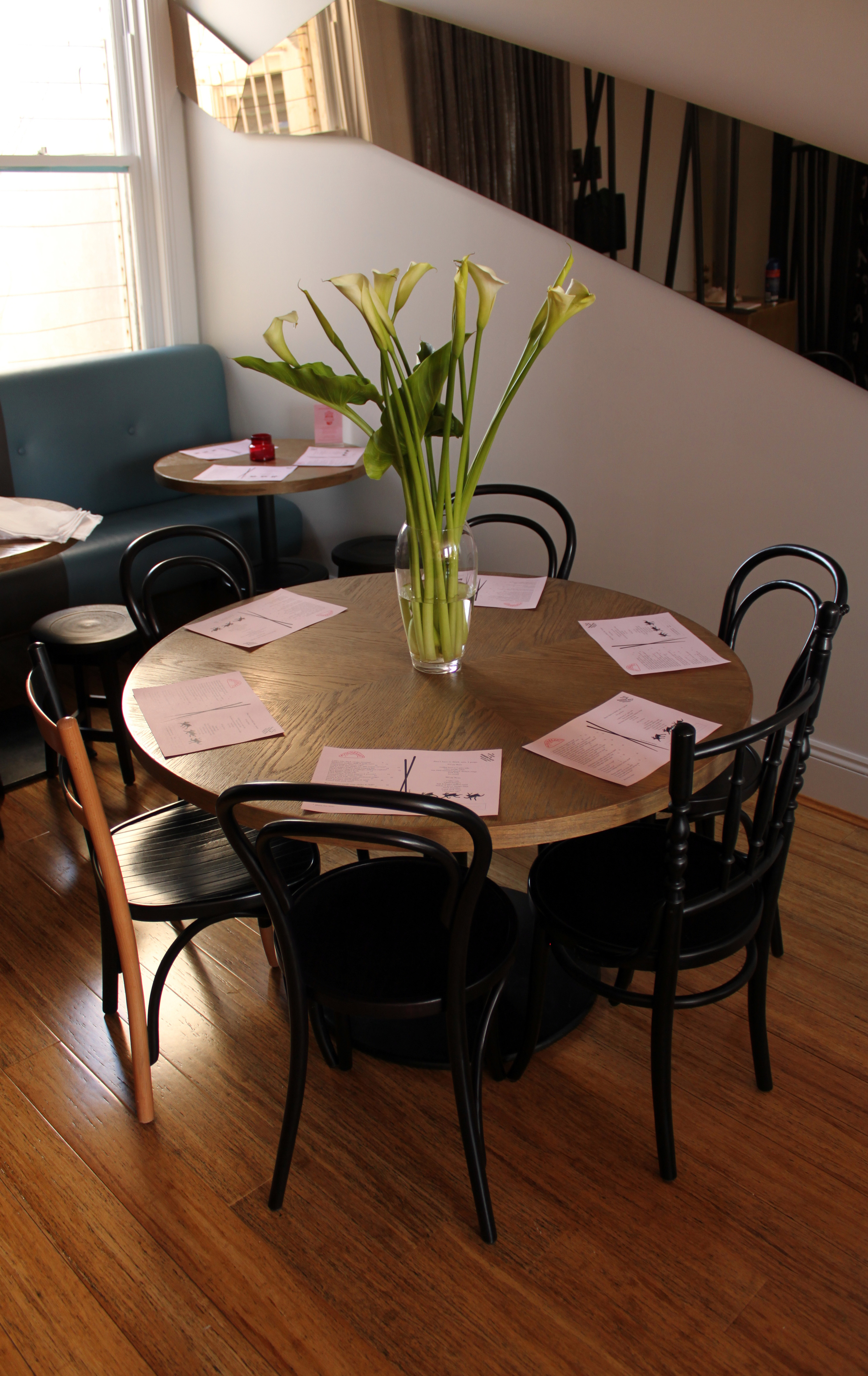
LEVEL 2 is the main dining area. This area was opened up, the soft furnishings were replaced with new solid timber furniture in a dark wenge stain. The space has been simplified and cleaned up and now the focus turns to the bold features that add the fun and culture to the Red Rabbit. Again the use of strong branding helps reinforce the underlying themes within the space.

budget: $$

design time: 3 weeks

build time: 2 weeks

pd-sp-AW-20131101122331582594-620x0.jpg
sm-art-red-rabbit-20131101151840611986-620x0.jpg
aplincreative1sm.jpg
aplincreative2sm.jpg
aplincreative3sm.jpg
aplincreative4sm.jpg
aplincreative5sm.jpg
IMG_1852 copy.jpg
IMG_1872.jpg
IMG_1874 copy.jpg
IMG_1877 copy.jpg
IMG_1884.JPG
IMG_1899.JPG
IMG_1945.JPG
pd-sp-AW-20131101122331582594-620x0.jpg sm-art-red-rabbit-20131101151840611986-620x0.jpg aplincreative1sm.jpg aplincreative2sm.jpg aplincreative3sm.jpg aplincreative4sm.jpg aplincreative5sm.jpg IMG_1852 copy.jpg IMG_1872.jpg IMG_1874 copy.jpg IMG_1877 copy.jpg IMG_1884.JPG IMG_1899.JPG IMG_1945.JPG
Wednesday 11.20.13
Posted by Chris Aplin
 

POSH COMFORT

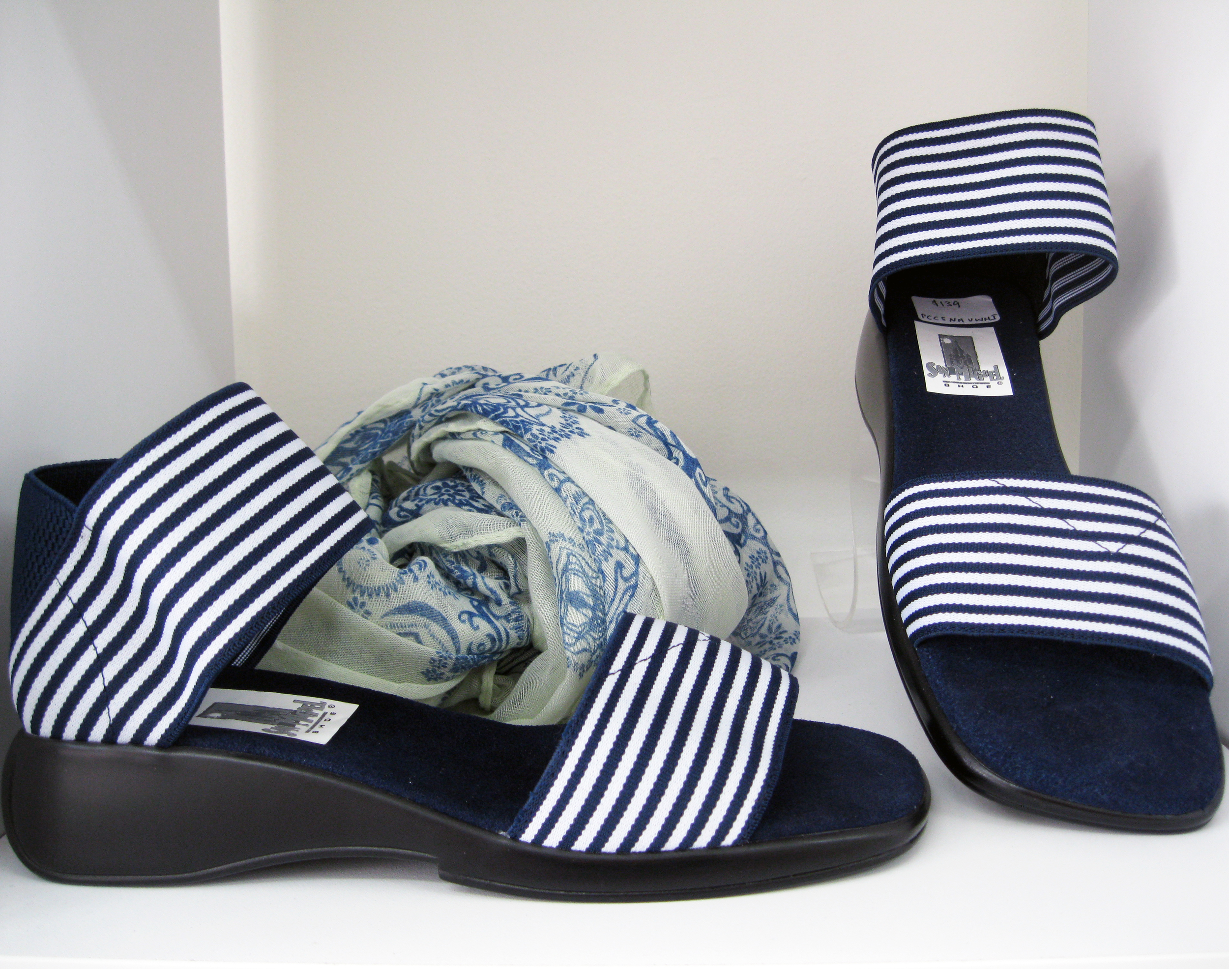
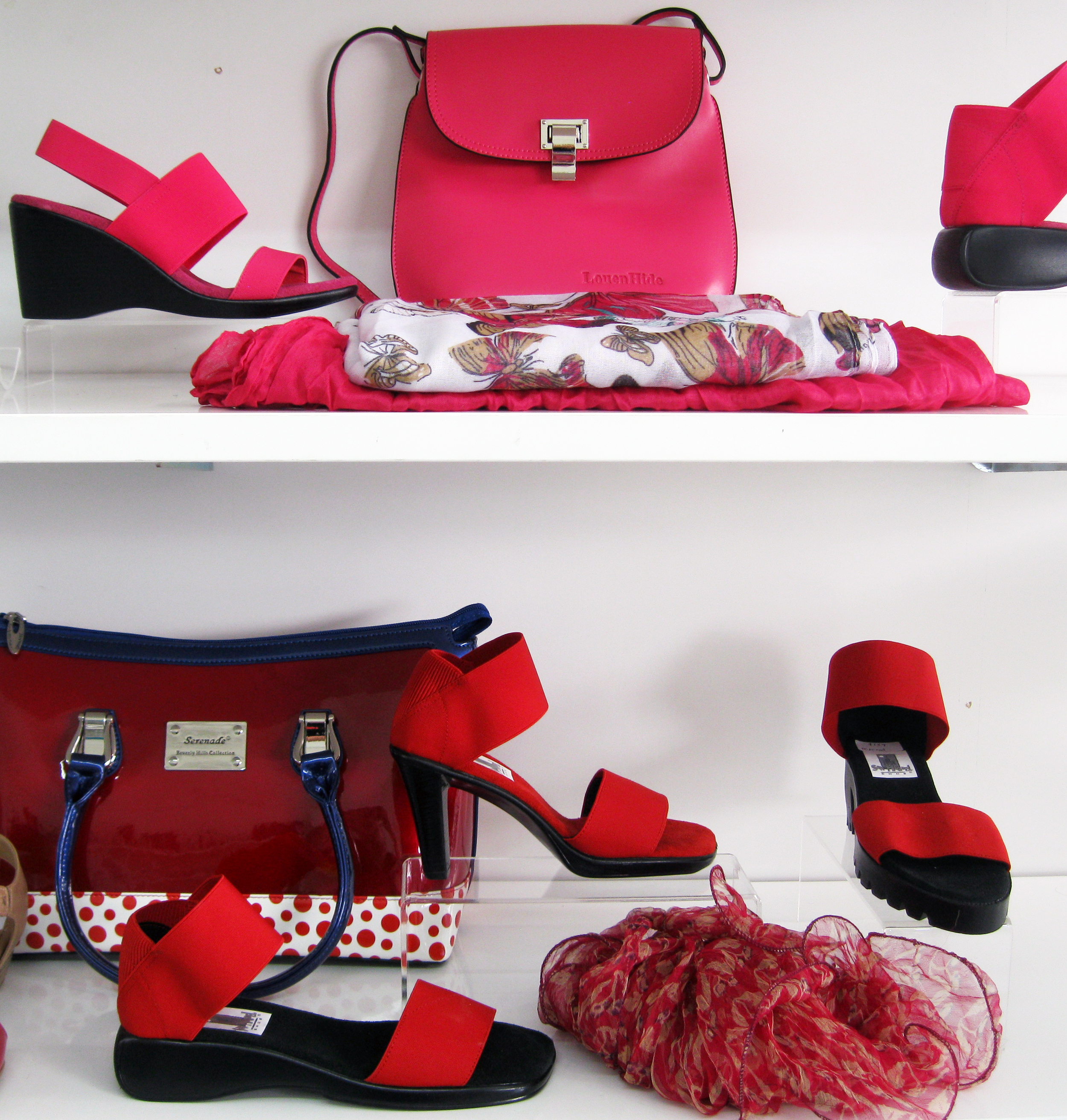
The Posh Comfort retail store is the new home of San Miguel Shoes in New Zealand. The store opened in early October and is the first in New Zealand to stock the popular product.

Jane Hayman, the owner of Posh Comfort, has years of experience in retail. She has owned a number of retail stores in South Africa and New Zealand. This is her next adventure as she brings a truly great product to the streets of New Zealand. Jane has selected a beautiful range of complementary footwear, handbags and accessories to bring together an exceptional product collection. 

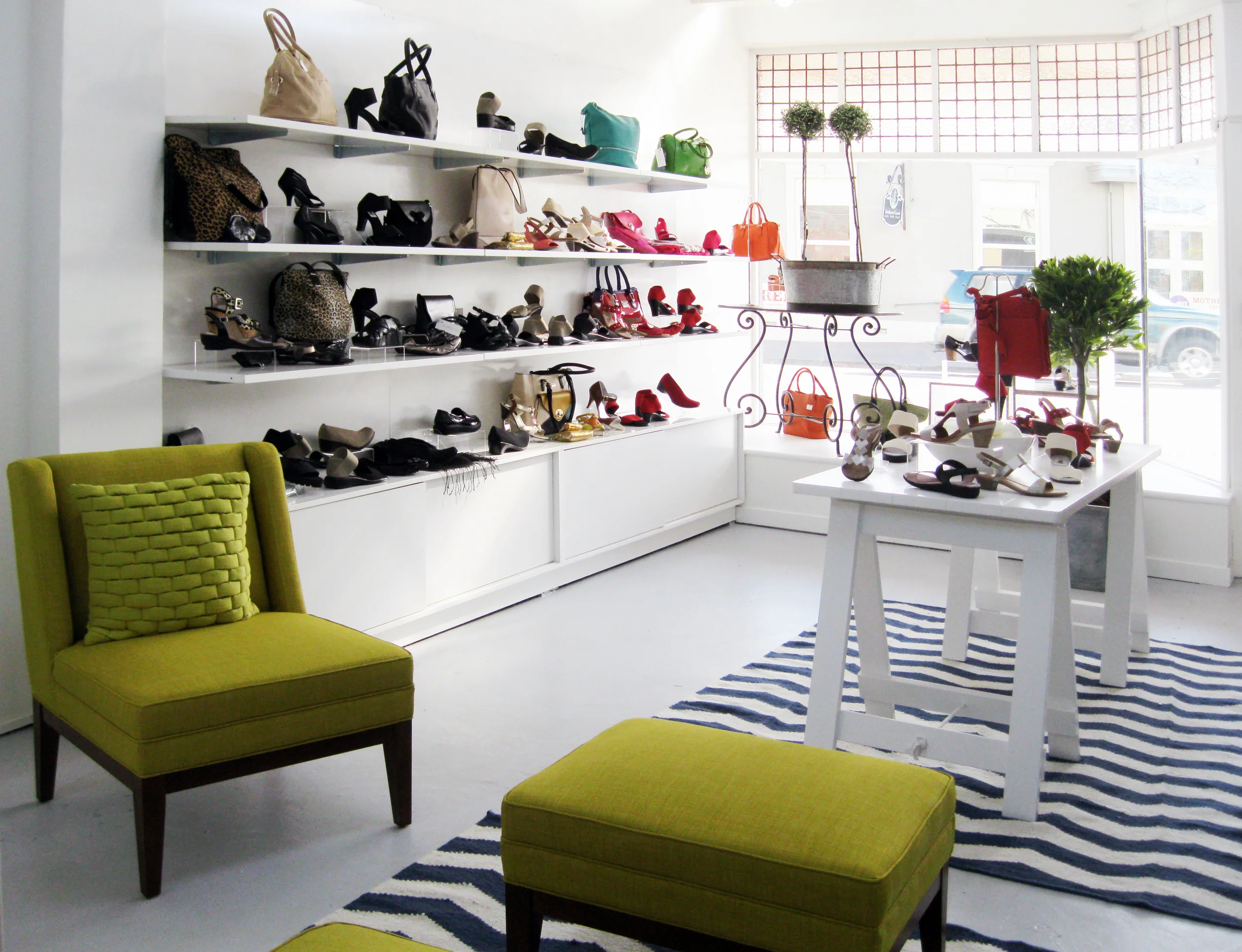
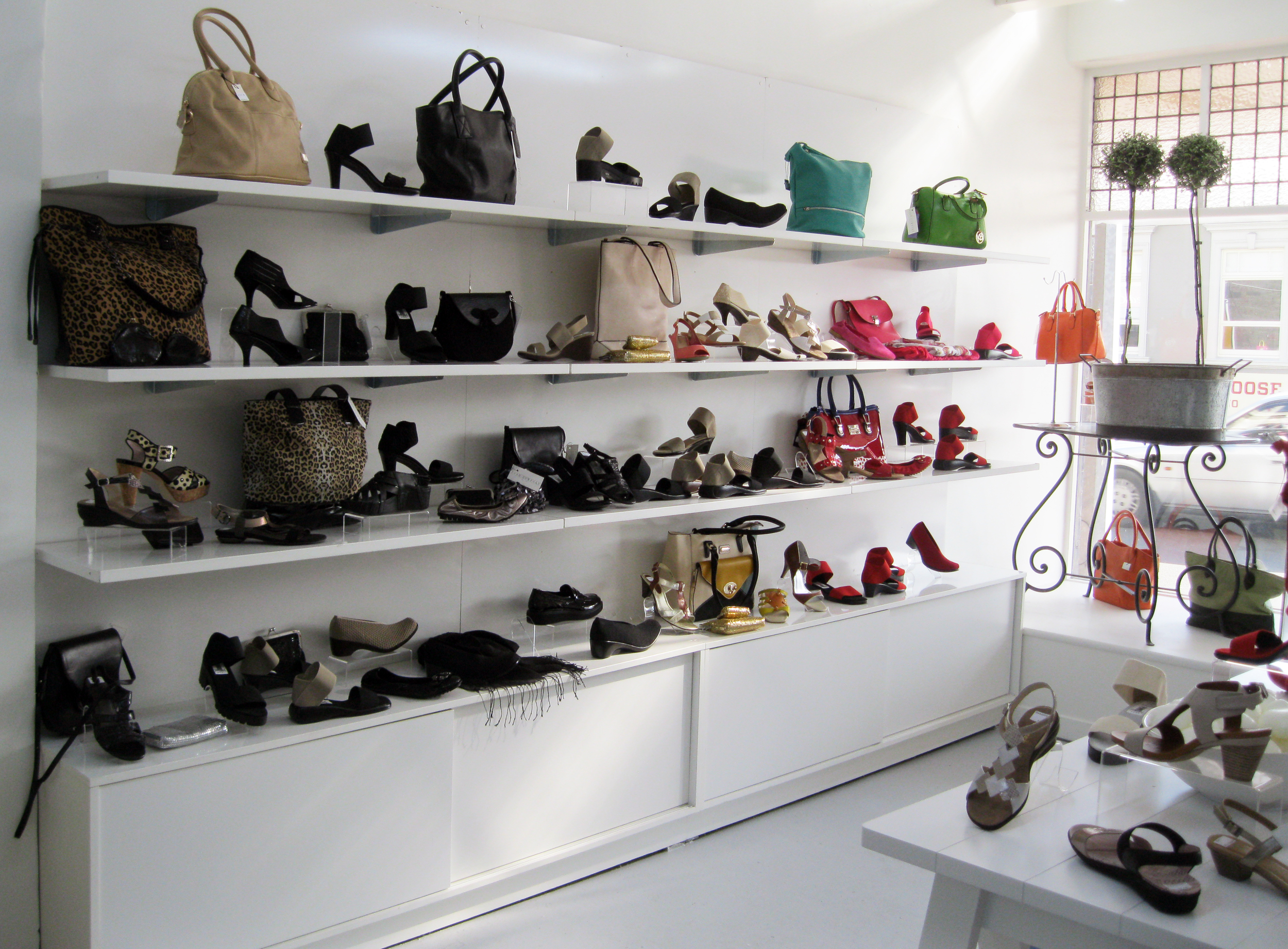
POSH COMFORT - retail store

POSH COMFORT - retail store

POSH COMFORT - retail store

POSH COMFORT - retail store

The design brief for the store was to focus on the product. The key consideration was the changing trends and seasons. The range is vibrant and strong in summer seasons and more conservative for the cooler seasons. We made a conscious decision to keep the base build of the store clean and the colour pallet simple, as the product has so much life. We used focused textures and colours to bring life to the space but only in the areas without product. 

POSH COMFORT - finishes &amp; fixtures

POSH COMFORT - finishes & fixtures

With consideration to the vibrant product and seasonal fashion changes, we designed the store to work as a blank canvas for the product. In footwear and accessory stores, product is easily confused with a complicated fit out.
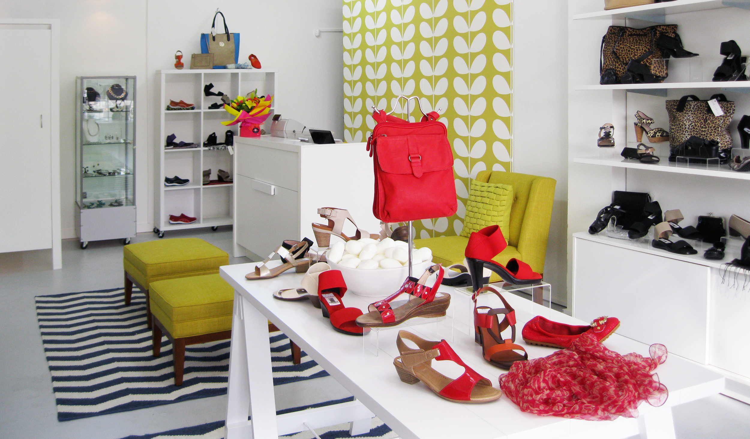
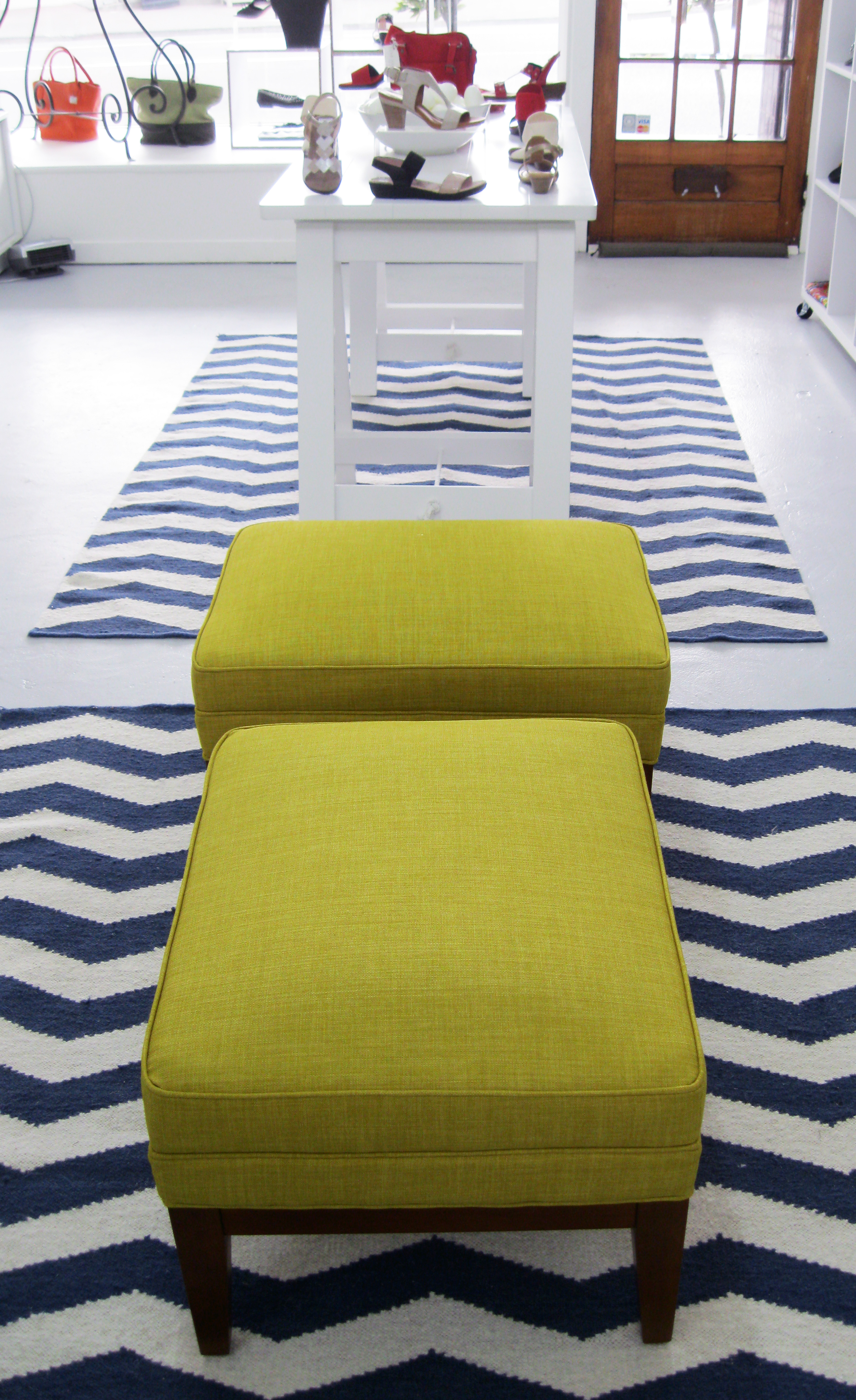
The application of colour in this space is through selected surface treatments and soft furnishings. Another benefit to this is the flexibility within the space. This is because these treatments are easy to change to keep the store on-trend and fresh. The wall coverings behind the POS and the floor rugs are examples of areas that can be replaced easily when required.
POSH COMFORT - plan and elevation

POSH COMFORT - plan and elevation

With a limited existing store room and a lot of stock, the first step was to increase the storage capacity. We did this by bringing stock into the store and separating it with a feature wall. This wall is located behind the POS which gave us a great opportunity to bring in some strong colour on a large scale. This colour is repeated and complemented in the soft furnishings. The shelving and fixtures are versatile and were selected with consideration to growth of the accessories range and the introduction of an apparel range.

budget: $

design time: 3 WEEKS

build time: 1 WEEK

2013-10-14 15.06.17.jpg
2013-10-14 15.08.45.jpg
2013-10-14 15.04.54.jpg
2013-10-17 14.57.56.jpg
2013-10-17 15.07.05.jpg
2013-10-17 14.58.48dd.jpg
2013-10-17 15.05.10.jpg
2013-10-14 15.06.17.jpg 2013-10-14 15.08.45.jpg 2013-10-14 15.04.54.jpg 2013-10-17 14.57.56.jpg 2013-10-17 15.07.05.jpg 2013-10-17 14.58.48dd.jpg 2013-10-17 15.05.10.jpg
Friday 10.25.13
Posted by Chris Aplin
 

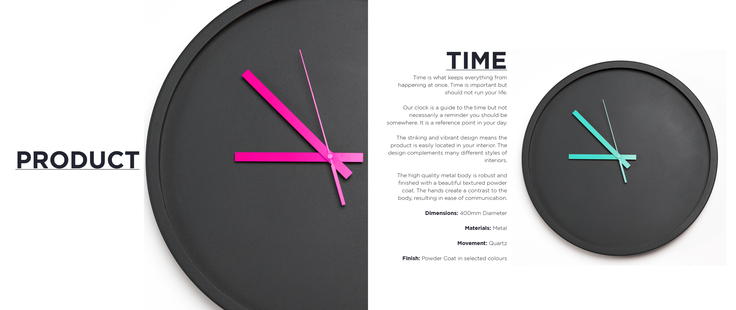
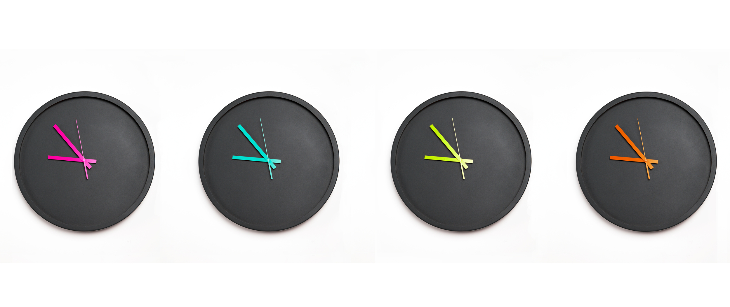
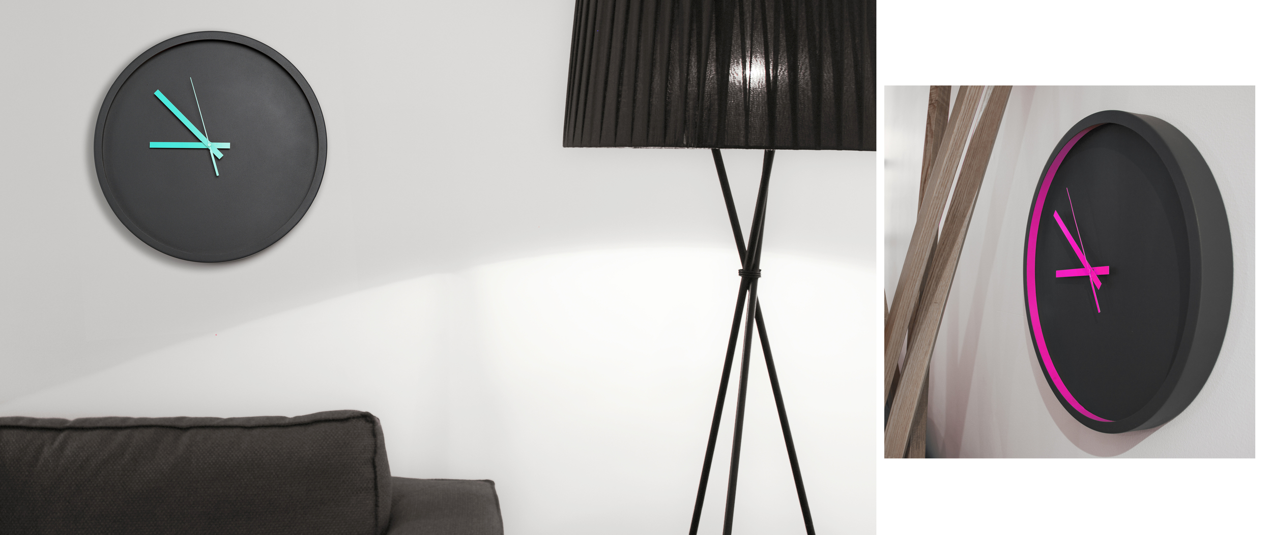
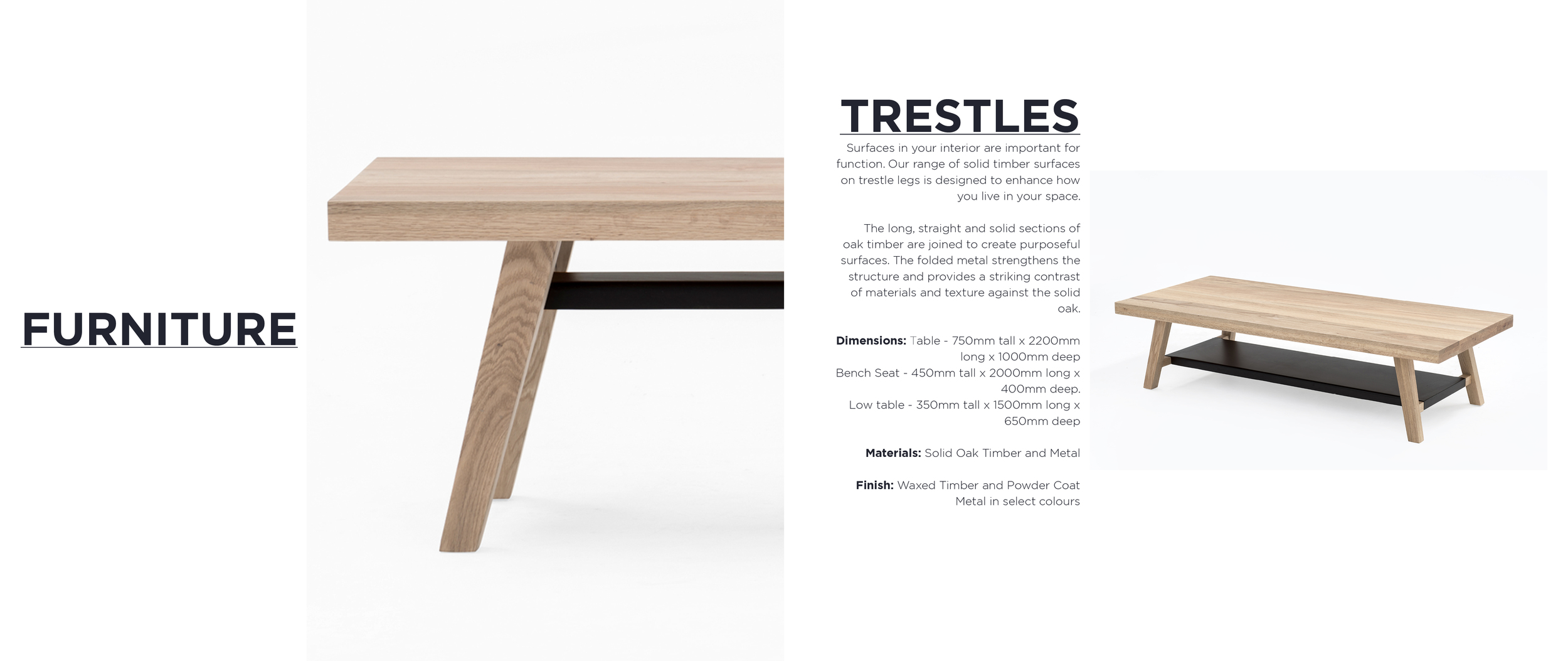
aplin creative - look book

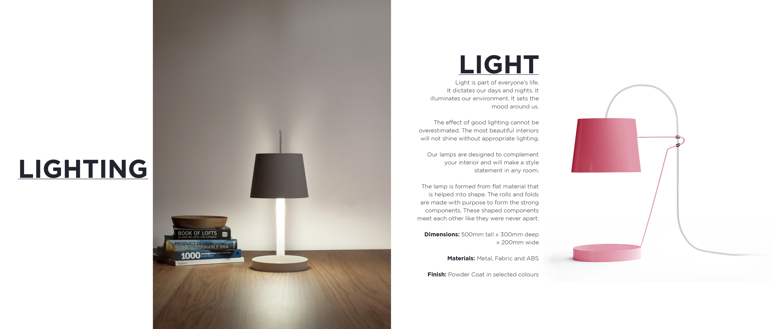
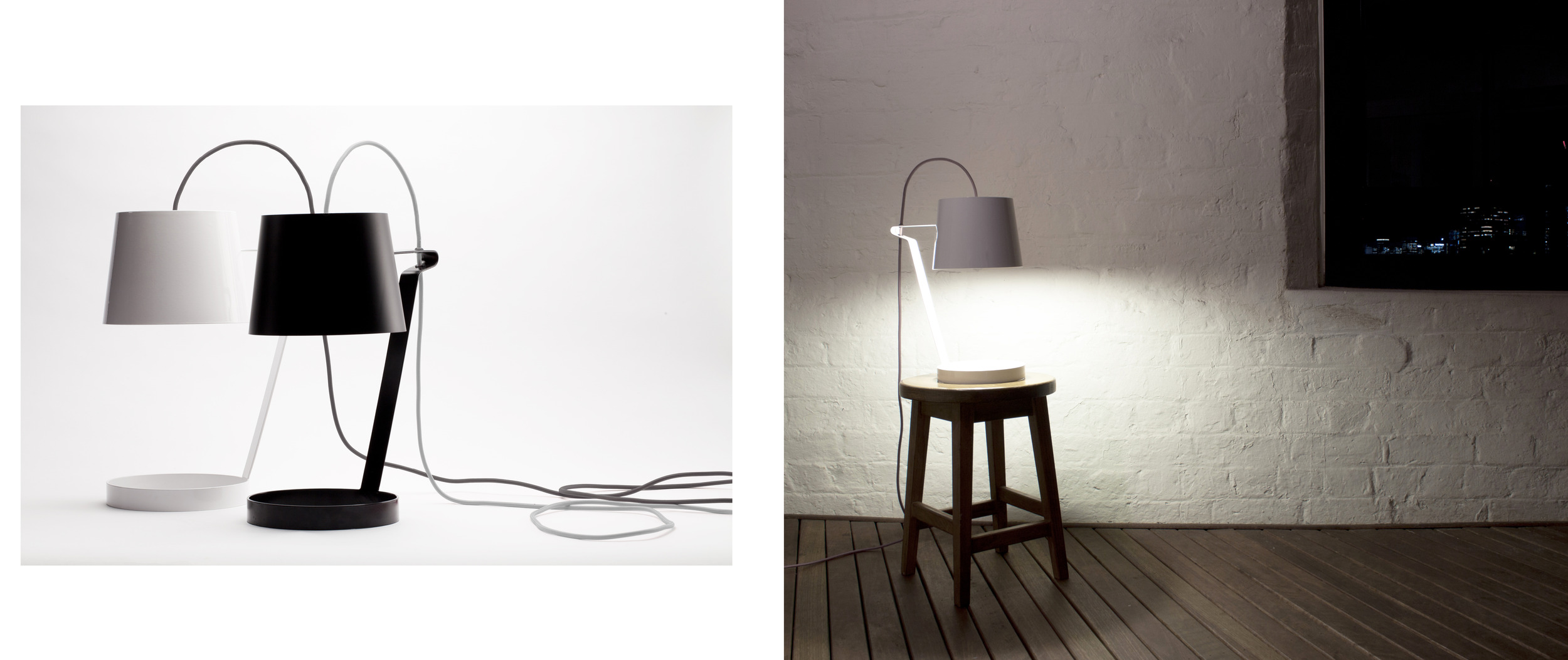
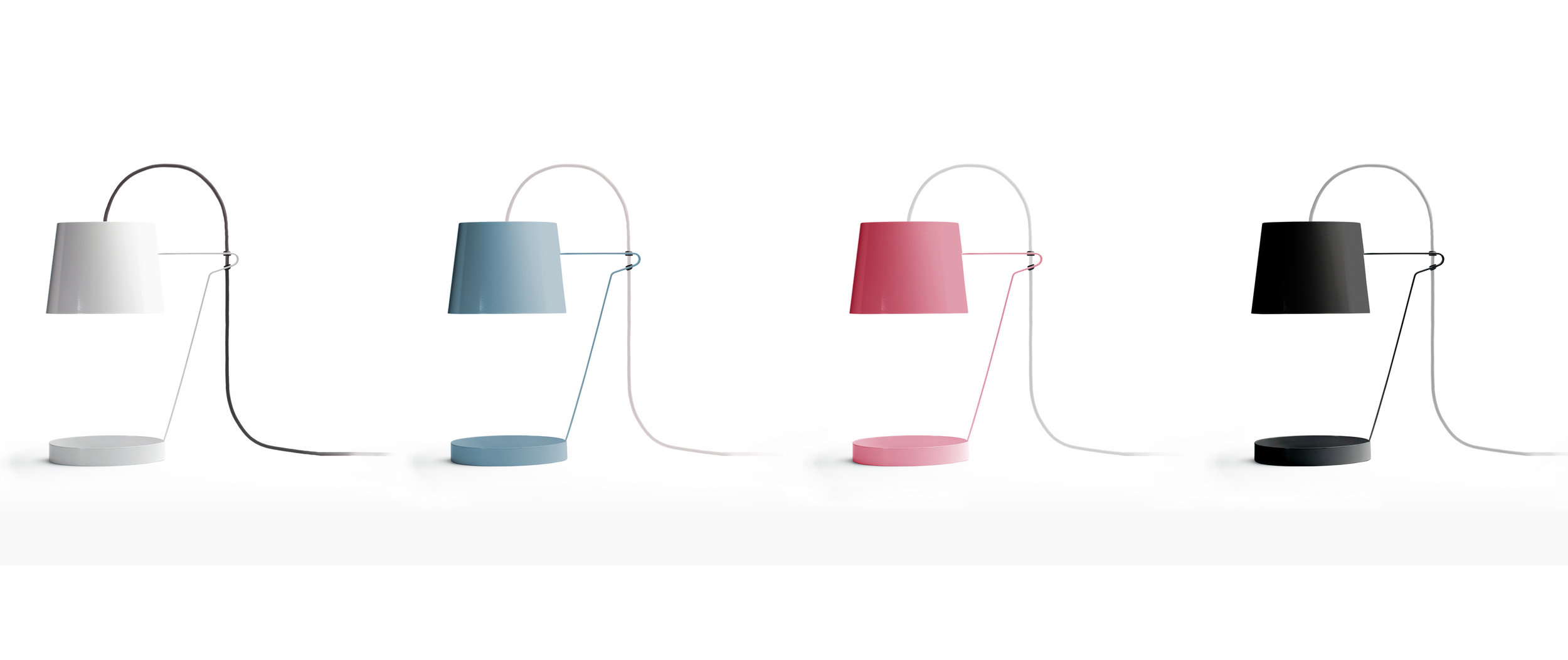
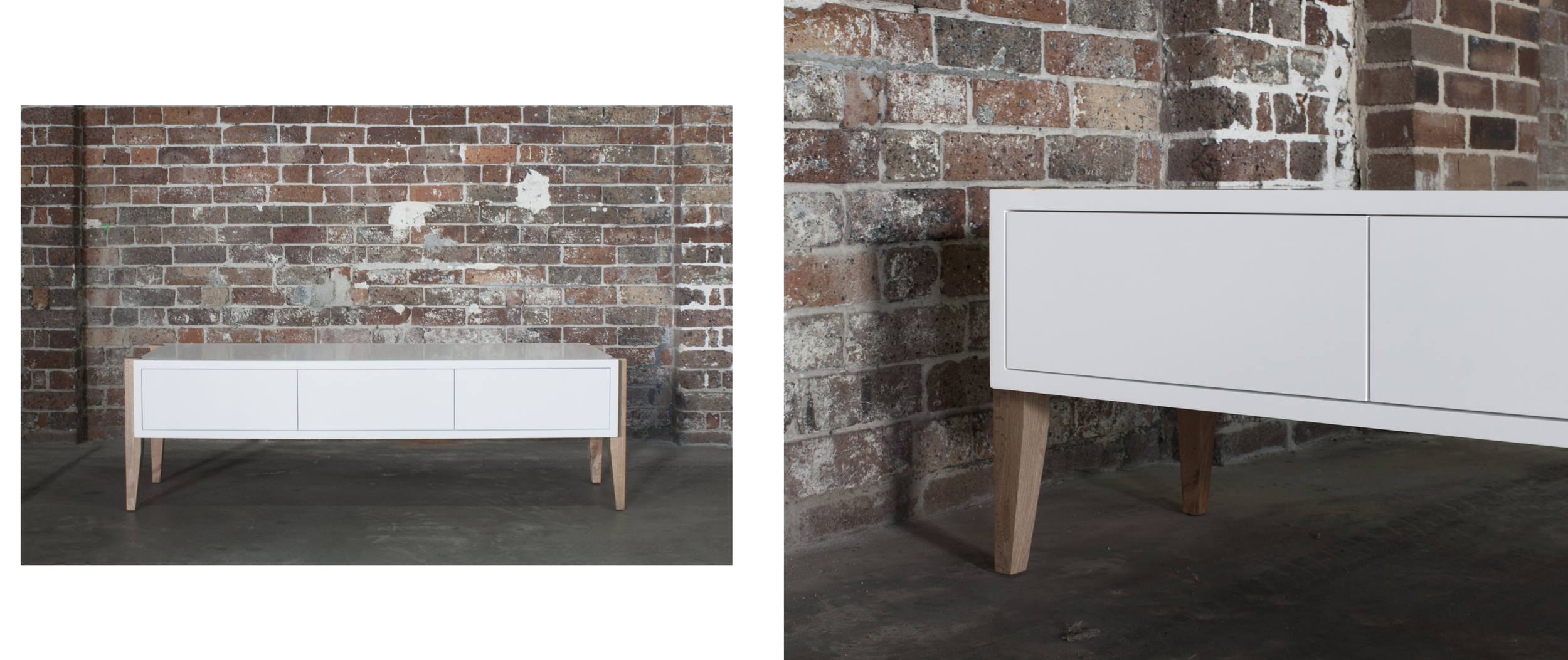
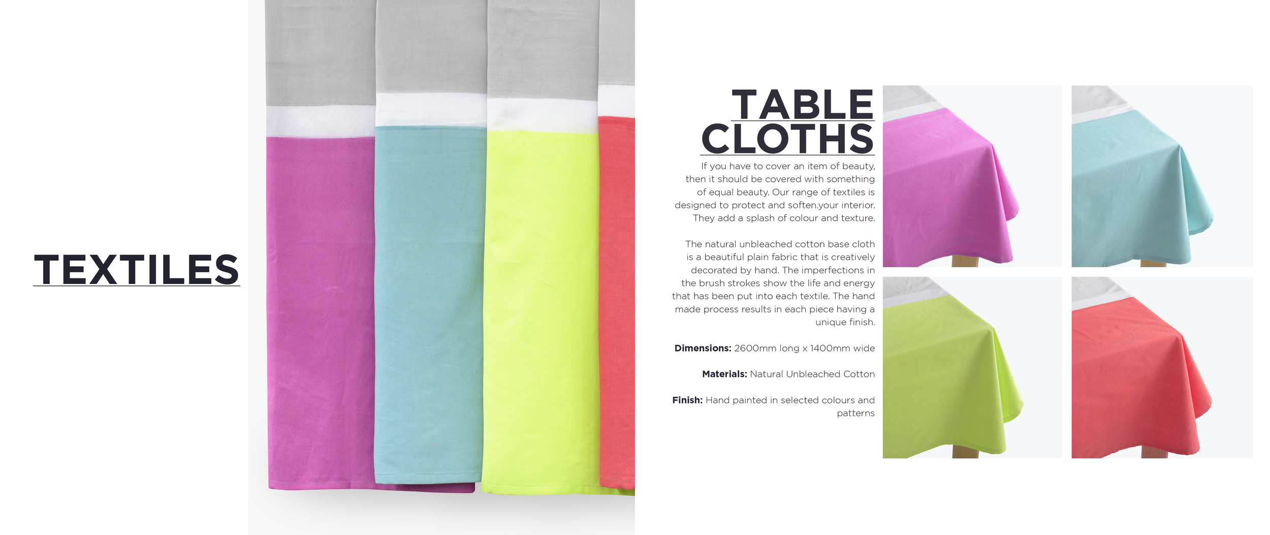
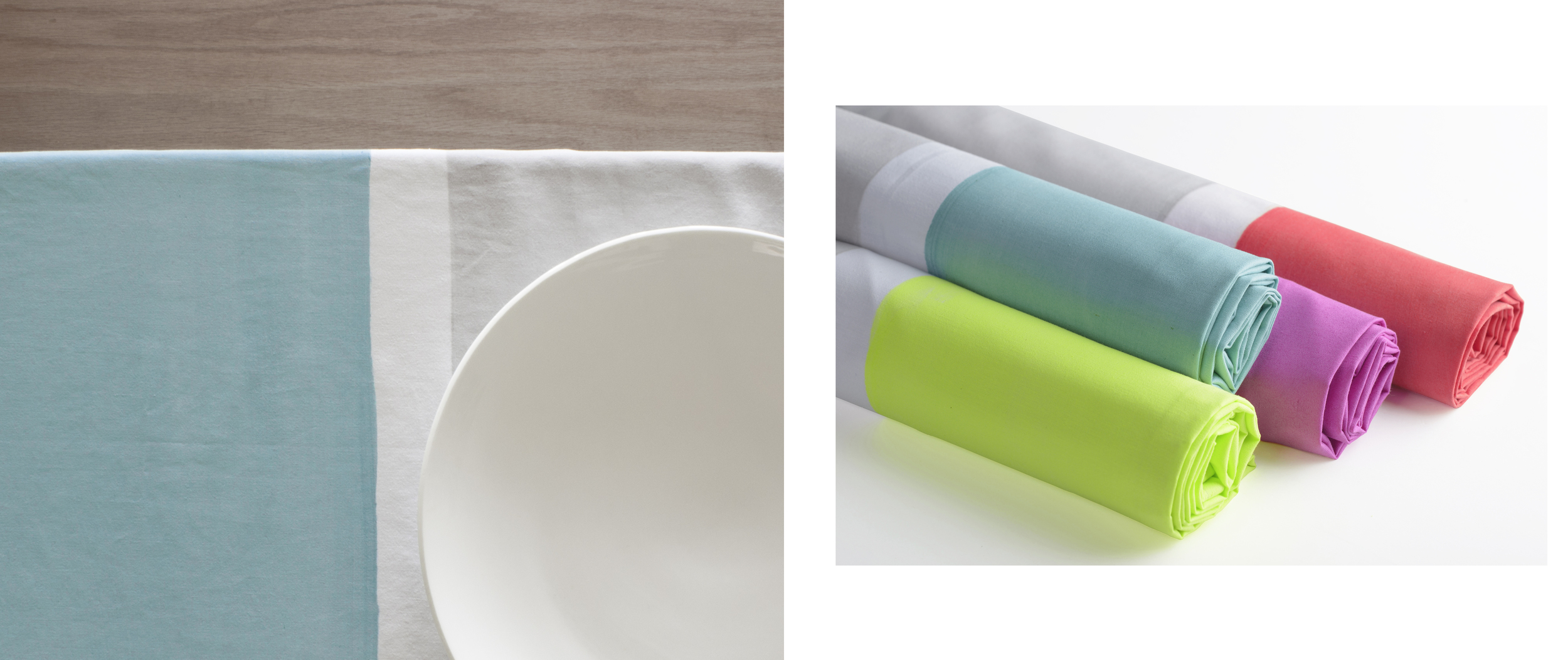
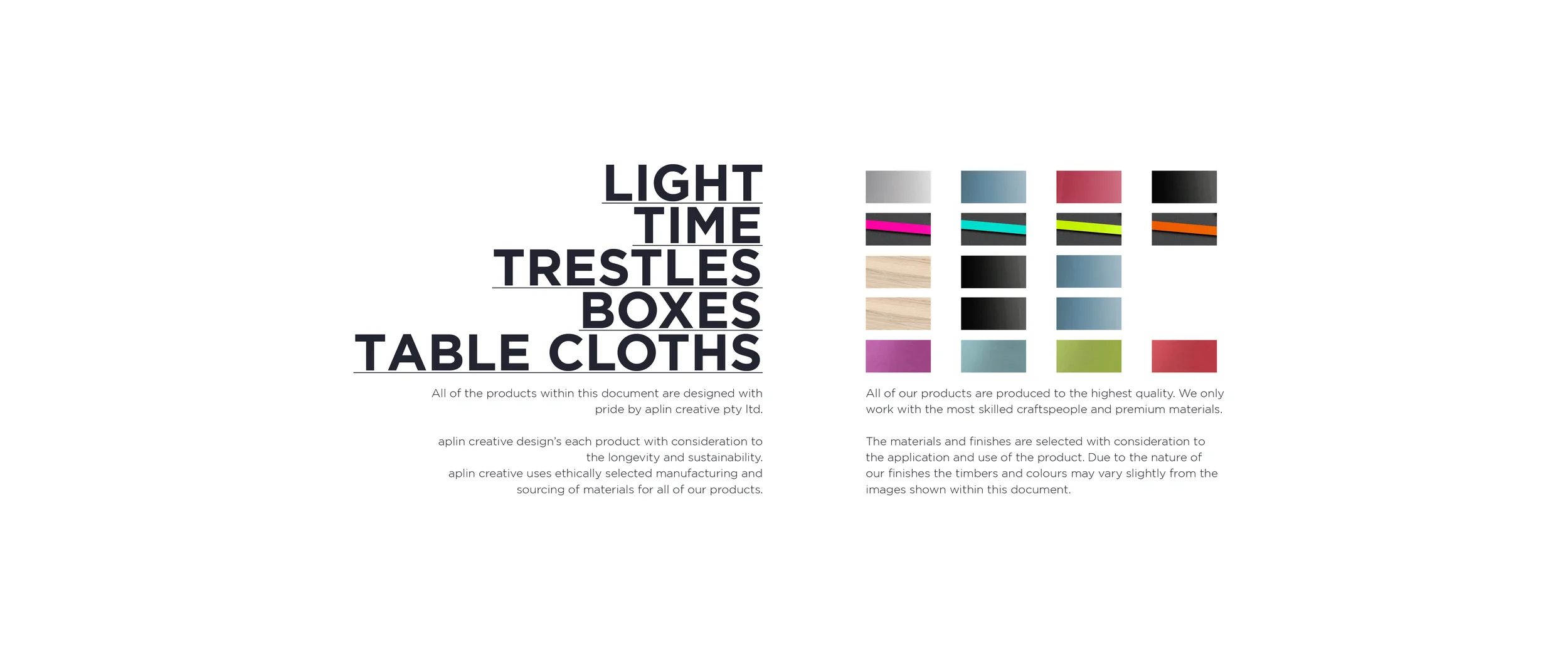
aplin creative is proud to announce the release of our first ever lookbook. The lookbook previews our upcoming range of product, lighting, textiles and furniture.  

Our new lighting and textiles arrive soon, so look out for them in our online store.

Look Book 2013050613.jpg
Look Book 20130506132.jpg
Look Book 20130506133.jpg
Look Book 20130506134.jpg
Look Book 20130506135.jpg
Look Book 20130506136.jpg
Look Book 20130506137.jpg
Look Book 20130506138.jpg
Look Book 20130506139.jpg
Look Book 201305061310.jpg
Look Book 201305061311.jpg
Look Book 201305061312.jpg
Look Book 201305061313.jpg
Look Book 201305061314.jpg
Look Book 201305061315.jpg
Look Book 201305061316.jpg
Look Book 201305061317.jpg
Look Book 201305061318.jpg
Look Book 2013050613.jpg Look Book 20130506132.jpg Look Book 20130506133.jpg Look Book 20130506134.jpg Look Book 20130506135.jpg Look Book 20130506136.jpg Look Book 20130506137.jpg Look Book 20130506138.jpg Look Book 20130506139.jpg Look Book 201305061310.jpg Look Book 201305061311.jpg Look Book 201305061312.jpg Look Book 201305061313.jpg Look Book 201305061314.jpg Look Book 201305061315.jpg Look Book 201305061316.jpg Look Book 201305061317.jpg Look Book 201305061318.jpg

For inquires and a digital copy of the look book please email info@aplincreative.com

Thursday 09.26.13
Posted by Chris Aplin
Comments: 1
 

aplin creative - website launch

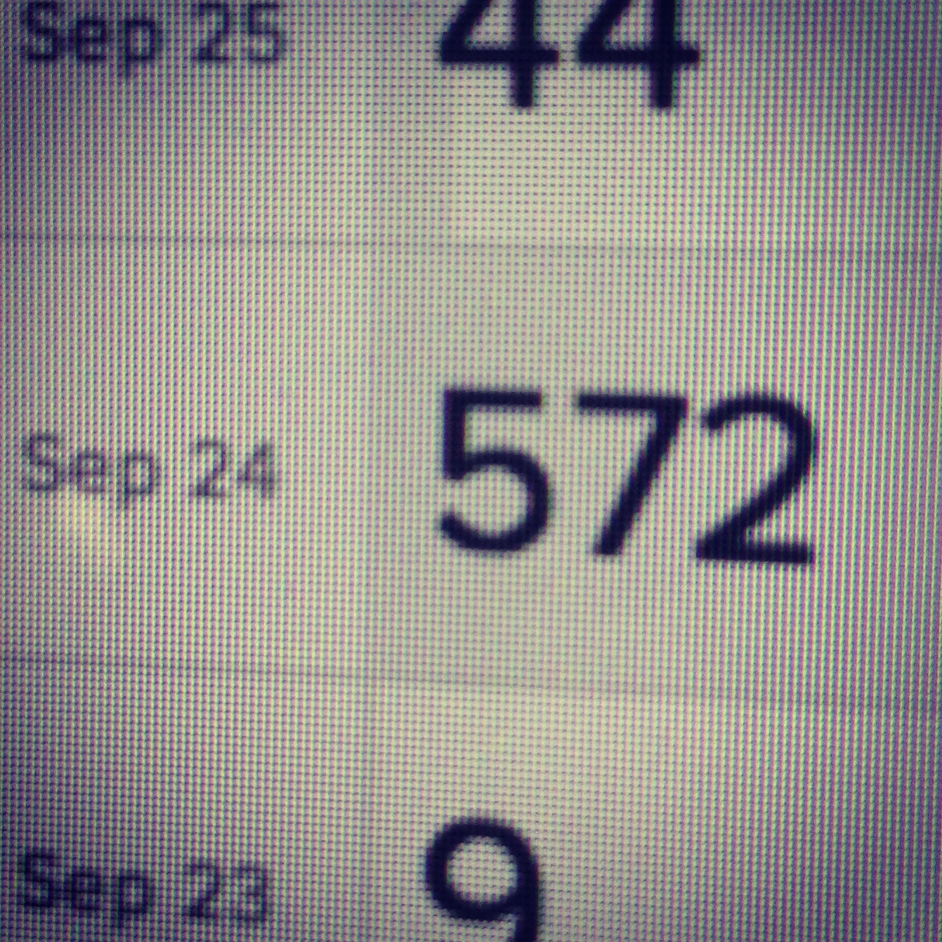
After years of hard work, aplin creative officially launched its website on the 24th of September, with a great response. We had 572 hits on our first day and we would like to thank everyone involved for their help and support to get the site up and running. 

Thursday 09.26.13
Posted by Chris Aplin
 
Newer / Older

all rights reserved aplin creative pty ltd.